
We analysed the Recruiter “Hot 100” websites
Here’s what we learned about recruitment agency websites
Every year, “Recruiter” releases their “Hot 100” list.
We put all 100 websites through their paces to help you understand what the recruitment industry’s stars are doing right (and wrong) online.
In this study we tested:
- Structured job data
- Social sharing images
- Web performance
- SEO
- Accessibility
- Vendors and platforms
And in this article I’m going to share what we discovered.
Challenges and limitations
- Some of the companies on the list are recruitment groups. In these cases, we picked one of the brand websites.
- Some companies may have already updated or completely changed their websites.
- Performance scores are volatile and can change from minute to minute.
- We’ve tried to remain as impartial as possible and present the data as-is. (Link to the data in the conclusion)
A summary of our key findings
- 11% have no job posts listed on their website.
- Of the sites with single job posts, 27% have no valid JobPosting structured data, meaning they won’t be indexed by Google for Jobs.
- 30% of the sites with job posts have no social sharing image, and only 1 had a custom, generated social image for each job.
- According to Google, the average performance of a single job page is a poor 57.
- The most popular vendor is Volcanic, powering 1⁄4 of all sites.
- WordPress is the most popular platform, powering 26% of the sites.
Not all recruitment agencies list their jobs on their websites
Our first test was to try to find job posts on each website.
Unsurprisingly, most recruitment agencies list jobs on their websites, but a surprising number don’t.
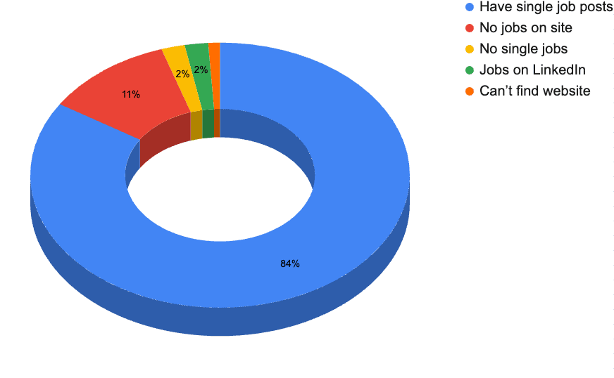
Most, 84%, have some kind of job board with single pages for each job post.
2% listed their jobs but didn’t have unique pages for each one.
2% linked through to their jobs on LinkedIn.
However, 11% of websites in the Recruiter Hot 100 do not have any jobs listed on their websites.
Over a quarter of sites with job posts are missing out on traffic from Google for Jobs
Their jobs might be listed on Google for Jobs courtesy of other job boards, but 27% of the sites with single job posts did not have valid structured data.
We tested this using Google’s Rich Results Test.
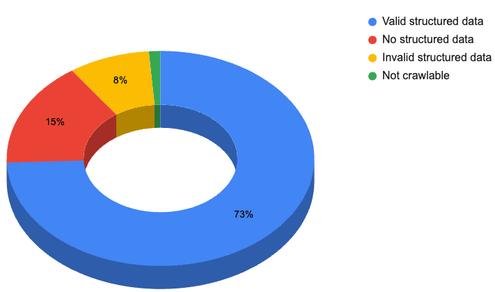
By adding valid structured data to job posts, Google can add these to their Google for Jobs index. This is free advertising and a potentially huge traffic source back to the website.
Read our recruiter’s guide to structured data.
Social sharing images are a massively under-used feature of job posts
Social sharing images are images that are displayed by social networks when you share a link to a web page.
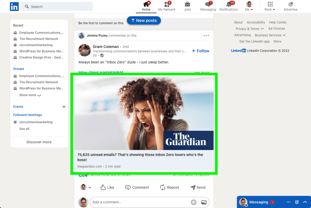
Social sharing images for jobs are a way to increase the engagement of your job posts when shared on social media.
We passed each job through LinkedIn’s Post Inspector tool to preview the social sharing image.
Social networks can pick an image to use from a web page, but, with some code, it’s possible to define a specific image to use.
At the highest level, it’s possible to automatically generate social sharing images for each job individually.
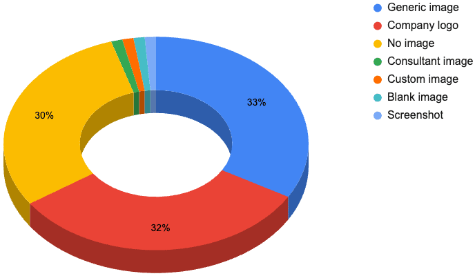
Our research shows that nearly all recruitment agency websites have unoptimised social sharing images.
33% use a generic image for all job posts. 64% of these contain the recruitment agency logo.
32% of the social sharing images were simply the logo of the recruitment agency.
30% had no social sharing image at all.
1 of the sites used an image of the consultant attached to the job post.

Another 1 of the sites had a blank white image.
1 site had a screenshot of their website.

Only 1 of the sites had an branded, job specific image for each job – brewermorris.com

This feels like a big opportunity for a competitive advantage for recruiters.
Average Google PageSpeed scores for single job pages
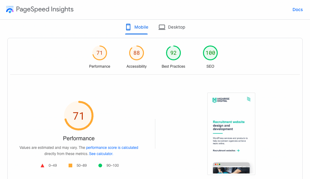
We put each of the website home pages and single job pages through the Google Measure tool (which has now moved to PageSpeed Insights).
This scores the page on:
- Performance
- Accessibility
- Best practices
- SEO
It is important to note that these scores are for a single moment in time. They can change from minute to minute, and a more rigorous test would be to put them through the tool multiple times and take an average.
However, as we are averaging the scores across 100 sites, and not looking at each website individually, then the differences are less of a concern.
Home page scores
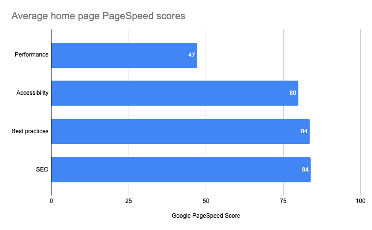
Average home page PageSpeed scores:
- Performance: 47
- Accessibility: 80
- Best practices: 84
- SEO: 84
Single job page scores
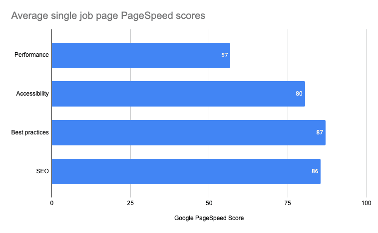
Average job post PageSpeed scores:
- Performance: 57
- Accessibility: 80
- Best practices: 87
- SEO: 86
The only significant difference between home and job pages are the performance scores, with job posts scoring an average of 10 points higher than the home pages.
This is unsurprising as home pages tend to be rich in graphics, images, videos, etc whereas job posts are usually mostly text content.
Page “performance” scores vary considerably and are fairly low across the survey
The averages of 47 and 57 for the home and job post page performance is disappointingly low.
What is perhaps more striking is the huge variation in performance speeds across the board, with values as high as 92 and as low as 13 for home page performance.
Find out how these scores are calculated.
There is no discernible correlation between the “Hot 100 rank” and job page performance
You might expect to see the top agencies have higher performing websites but there doesn’t seem to be any correlation.
It’s important to note that the “Recruiter Hot 100” list isn’t the ‘top’ recruiters in the World, but the recruiters with the best profit per head. There might be a stronger correlation if the agencies were ranked solely by profit. Would there?…
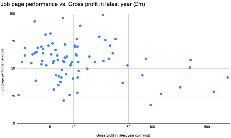
If anything, it looks like there is a reverse correlation between gross profit and performance.
There are lots of potential reasons for this. For example:
- The larger agencies might have older sites
- Large agencies might have bigger, more feature-rich sites
- Smaller agencies might be trying to find ways to get an advantage over the bigger players
That’s all speculation, but it does appear that a weak reverse correlation exists.
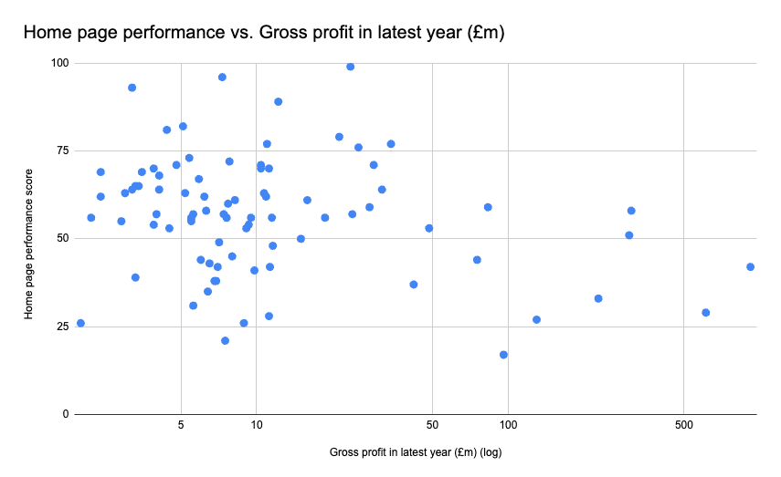
Higher ranking sites don’t have more performant home pages
As with the job post pages, there doesn’t seem to be any correlation between home page performance and Hot 100 rank.
Using gross profit on the X-axis again suggests a weak reverse correlation.
Onsite SEO is fairly consistent around the “good” scores
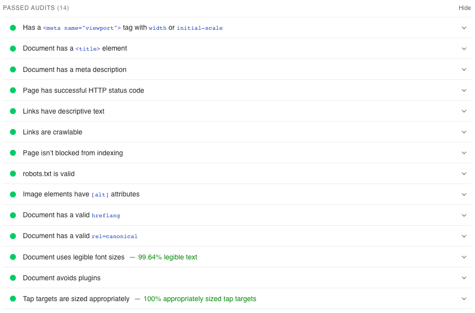
The Google PageSpeed Insights tool gives each web page an SEO score.
The page is put through a series of tests and scored based on how well it does in those tests.
Tests include:
- Title text
- Meta descriptions
- Descriptive text for links
- Crawlable links
- Valid robots.txt etc.
Run a page through the PageSpeed Insights tool, click the SEO tab and you’ll see the audits that have passed and failed.
It is important to note that these are strictly on-site, technical SEO checks. Some of the most important SEO factors (e.g. content quality and backlinks) are not measured here.
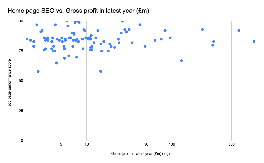
There is no correlation here and that’s not surprising given how many factors contribute to SEO.
It would be interesting to delve deeper into the SEO side of things to see how these scores compare with search rankings, domain authority, backlinks, etc. I’ll do that research in a future report.
Volcanic is the most popular vendor (that we can detect)
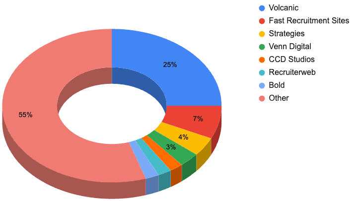
- Volcanic: 25%
- Fast Recruitment Sites: 7%
- Strategies: 4%
- Venn Digital: 3%
- CCD Studios: 2%
- Recruiterweb: 2%
- Bold: 2%
- Other: 55%
Finding the vendor of a website isn’t always possible. Some Vendors (like Volcanic) make this very easy with “Recruitment website by Volcanic” in the footer. Others took a bit more detective work. For many sites, we couldn’t find the vendor at all.
From the data we do have, it looks like Volcanic is the strong market leader.
WordPress is the king of recruitment website open-source platforms
Another factor that can be hard to reliably detect is the website platform.
We used a combination of the “Library Sniffer” Chrome extension and some poking around in the front-end code to try to find what was powering the websites behind the scenes.
We found three open-source web platforms in use; WordPress, Joomla, and Drupal.
Open source platform share
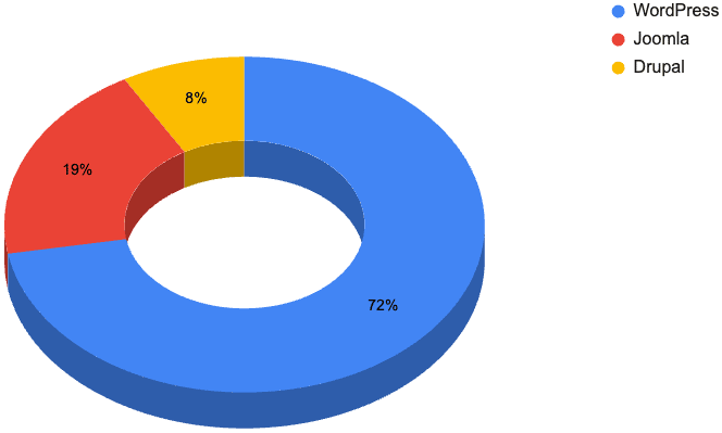
WordPress powers over 40% of the World’s websites, so it’s no surprise to see that, with 26% of the Hot 100 websites, it’s the most popular platform here too (just pipping Volcanic if you include closed-source platforms).
In second place comes Joomla! with 7% of the sites – all thanks to its use by Fast Recruitment Websites.
Last is Drupal with three websites in the Hot 100.
Related reading
Conclusion
If you’d like to dig a bit deeper, here’s a link to our data.
If you found this interesting/useful, please consider sharing it with your network.
What’s next?
We’d love to know your thoughts.
What has surprised you the most? What would you like to see included in future reports?
We’ve shared this report on LinkedIn where you can leave a comment for us.