Animating blocks on scroll with Intersection Observer
Written by on August 10, 2021
Animating blocks on scroll with Intersection Observer

What are we trying to build?
Love ’em or hate ’em, scroll triggered animations are everywhere right now. You know the ones, you scroll down a page and elements slide and fade in into view.
I love AND hate them. Done well and it can add a sense of sophistication and luxury. Badly executed and it looks cheap and tacky.
Either way, clients love them, so I needed to find a way to deliver this in a way that’s easy to use and not too big a performance hit.
Let’s break it down
To achieve this effect we need to:
- Hide and position the target elements
- Detect when a target element enters the viewport
- Transition to it’s final state
There are loads of different ways to do this. Until today, I was using a Javascript function to detect if an element is in the viewport and add a class if it was. That function was attached to a scroll event and throttled so that it didn’t have too big a performance hit.
There would be some CSS to hide and position the elements, and set the transition rules, and then another set of styles for when the item was in view.
In essence not much has changed. However, doing some basic research I found out about the IntersectionObserver API which natively does the viewport detection bit for you.
I also had to find a way to make this work with Gutenberg using my limited skills in that area.
Setting it up
Our block UI
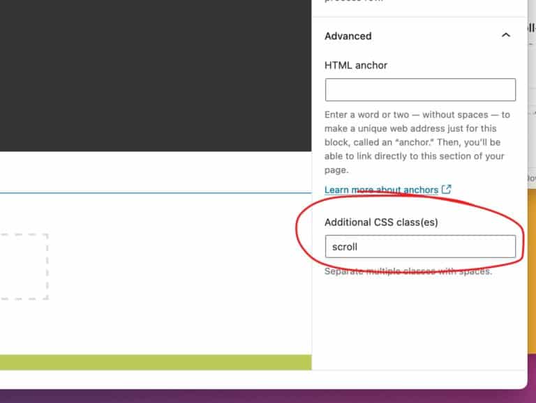
We need a way todetermine which blocks will be targeted and transitioned. I decided to use the ‘Advanced’ > ‘Custom class’ field as my block editor UI. Crude, but it works.

Enqueing the assets
There are only two assets required for this, a Javascript file and a CSS file (or SASS/SCSS partial).
So, if you’re following along, go ahead and enqueue your files or find a place in a current file that makes sense to add this code.
I created a JS file called scroll-animation.js and enqueued it like so:
<?php
/**
* Enqueues the theme modules scripts.
*/
function hd_theme_enqueue_module_scripts() {

  // enqueue scroll animation script.
  wp_enqueue_script(

    'hd_scroll_animation',
    get_template_directory_uri() . '/assets/js/modules/scroll-animation.js',
    '',
    '',
    true

  );

}
add_action( 'wp_enqueue_scripts', 'hd_theme_enqueue_module_scripts' );
Hiding our elements
We want to hide and position our target elements. We’ll do that with some CSS.
To set our targets, we’re going to be adding a custom class of .scroll to the blocks.
We’ll hide our elements using opacity and position them with a transform so that they keep their position in the flow and they will transition smoothly.
Our first bit of CSS is therefore:
.scroll {
	opacity: 0;
	transition: all 1s ease-out;
	transform: translate3d(0, 2rem, 0);
}
All of the above is up for customisation. You could change the transition duration, easing type and the translation (in this case 2rem from the top) to suit your own needs.
We’ll also need a style rule for when an element has entered the viewport. This rule will effectively undo the rule above.
To do this we’ll use a class of .scrolled-in like so:
.scrolled-in {
	opacity: 1;
	transform: translate3d(0, 0, 0);
}
That’s actually all of the CSS that you need to get this working at a very basic level. Therefore, lets move onto the more interesting part of this puzzle, the Javascript.
Detecting elements in the viewport with the InterSectionObserver API
First things first, I am not a good JS developer. This is a pure copy/paste hack job – but it seems to work. If someone wants to suggest improvements please reach out on Twitter.
The first thing that we want to do is to get all of the elements that we’ve assigned the .scroll class to. We’re going to avoid using jQuery here, so we’ll use:
const scrollList = document.querySelectorAll(".scroll")Next we’re going to set up our ‘observer’ with the IntersectionObserver API:
const myObserver = new IntersectionObserver(callback, options)IntersectionObserver takes two arguments; callback and options. I won’t go into detail, mainly because I don’t fully understand it all yet.
For now, we’re not going to set any custom options, so we’ll set it to empty like so:
const options = {}callback is where the fun starts. Here’s our callback function:
const callback = (entries, observer) => {
  entries.forEach((entry) => {

    if (entry.isIntersecting) {

        entry.target.classList.add("scrolled-in");
    }
  })
}
entries is the list of elements that we’re ‘watching’. We’re using two of the entry properties here;
isIntersecting– returns a boolean – ‘true’ if our intersection criteria is met.target– our observed element.
For each of the entries (our observed target elements) we’re then checking if our criteria has been met and adding a class of .scrolled-in to the element if it has.
We then need to run that observer on each of our target elements like so:
scrollList.forEach(scrollItem => {

  myObserver.observe(scrollItem)

})
Time to put all of that together:
That’s not a lot of code and we’ve acheived what we set out to achieve. Nice one! 👍
Taking things further
There are many ways that we could improve and extend upon what we’ve got. Let’s look at three of those:
- Different transition styles
- ‘Group’ animations
- Delayed transitions
- Improved accessibility
Different transition styles
So far our elements all use the same transition – sliding up from the bottom.
What if we wanted to be able to change the direction of the transition? We can do that fairly easily by creating new classes for each of the available transitions.
For example, to slide in from left to right we could use:
.scroll--fade-right {
    transform: translate3d(-2rem, 0, 0);
}
We could also combine vertical and horizontal movement like so:
.scroll--fade-up-left {
    transform: translate3d(2rem, 2rem, 0);
}
This starts the element 2rem to the right and 2rem from the top.
There are any number of variations that you could add here. Just remember to add both the scroll and the .scroll--[modifier] classes to your block.
‘Group’ animations
We now have the ability to add scroll triggered transitions to any block. That’s pretty powerful.
However, what if we want to animate an element within a block. For example, maybe you want to animate the image within a media and text block. Currently, that’s not possible.
Let’s fix that.
OK, so we need a way to trigger a child element of a block. And we need to do this using our very limited UI (the ‘Advanced’>’Additional CSS class(es)’ field).
One way to do this is to pass the class of our child element using a class on the parent element. For example, say we want to target the media in the media and text block. I can add the class .scroll-group--wp-block-media-text__media and then parse that to get just the wp-block-media-text__media part and then add that to our observer.
This will also come in useful for custom blocks that contain multiple items, for example card grids showing latest posts.
First, we’re going to create an object of all of our ‘scroll-group’ elements.
scrollGroups = document.querySelectorAll('[class*="scroll-group"]');Then we’re going to loop through each of these, get their classes, search for any that start with .scroll-group- strip the string from the end and use that to add the .scroll class to each of those elements.
Now all of our targeted children have the class that will trigger our observer function.
Let’s see if that works…
It does!
Ideally, we’d take that even further. For example, not all block children have classes that we can target. Want to target a list block list item (<li>) – there’s no class for that.You would need to add more data to your custom class, for example, .scroll-group--el--li and do some more parsing so that you could target the correct elements. That’s beyond the scope of this article (but if you get it working let me know!).
Group transition delays
Another little enhancement: sometimes it looks nice to add a slight delay to the transitions of sibling elements. For exanple, if you have a list you might want to transition in each item one after another.
We do it on the menu of this site:
After publishing this post, @gazchap pointed out that we can achieve the same effect using setTimeout in the observer function.
This is probably better as it allows for infinite items and doesn’t create a new rule for each nth item. I’ll show you both anyway, starting with the CSS.
CSS solution
To achieve this we can use a simple SCSS loop like so:
@for $i from 1 through 21 {

  [class*="scroll-group"] .scroll:nth-child(#{$i}) {

    transition-delay: .2s * $i;

  }
}
This will create 21 CSS rules (you can change the upper limit!) that look like this:
[class*="scroll-group"] .scroll:nth-child(1) {

    transition-delay: .2s;

}

[class*="scroll-group"] .scroll:nth-child(2) {

    transition-delay: .4s;

}

[class*="scroll-group"] .scroll:nth-child(3) {

    transition-delay: .6s;

}
Note: This only works if the target elements (.scroll) are siblings.
Here are the transition delays in action…
setTimeout solution
Here’s the code that Gareth sent me…
if ( 'IntersectionObserver' in window ) {
    let observer = new IntersectionObserver(function (entries, observer) {
        var delay = 0;
        entries.forEach(function (entry) {
            if (entry.isIntersecting) {
                setTimeout(function () {
                    // add the class that triggers the animation
                    entry.target.classList.add('animation-slideup');

                    // remove the tag
                    entry.target.classList.remove('to-animate');
                }, delay);

                // increase the delay to allow a cascading effect for the elements
                delay += 100; // in milliseconds

                // stop listening for this element
                observer.unobserve(entry.target);
            }
        });
    }, { rootMargin: "0px 0px -8% 0px" } ); // show elements when 15% up from the bottom of the viewport

    // observe animated elements
    document.querySelectorAll( '.to-animate' ).forEach( function (el) {
        observer.observe(el);
    } );
} else {
    document.querySelectorAll( '.to-animate' ).forEach( function( el ) {
        el.classList.remove( 'to-animate' );
    } );
}
We can add the setTimeout function to our code and see it in action here:
Accesibility
For many people, scroll-triggered animations aren’t just annoying, they make it almost impossible to use a website.
Modern browsers have introduced the ‘prefers-reduced-motion‘ media query which allows users to request that the system minimizes non-essential motion on a web page. That’s what we’ll use here.
Someone correct me if I’m wrong, but I think that we can wrap all of our CSS in @media (prefers-reduced-motion: no-preference) { /* rules go here */ }
That way, if someone has set their motion preference to ‘Reduce motion’ or ‘Remove animations’ they won’t see any of the transitions.
The final code
Our final JS file looks like this…
document.addEventListener("DOMContentLoaded", function(event) {

	// get all the scroll-group elemetns.
	scrollGroups = document.querySelectorAll('[class*="scroll-group"]');

	// for each scroll-group element.
        scrollGroups.forEach(el => {

		// create an array from the element classes.
		var elClasses = el.className.split ( ' ' );

		// for each of the classes in the array.
		for ( var index in elClasses ) {

			// if the class contains the 'scroll-group-' string.
			if ( elClasses[index].match ( /^scroll-group-/ ) ) {

				// get the string that follows after the '--' split.
				var targetClassName = elClasses[index].split ( '--' )[1];

				// get the children of the element that have the target classname.
				children = el.querySelectorAll('.' + targetClassName);

				// for each of the children with the target classname.
				children.forEach(el => {

					// add the 'scroll' class.
					el.classList.add("scroll");
				});

				break;

			}
		}
	});

	// get all of the elements with the 'scroll' class.
	const scrollList = document.querySelectorAll(".scroll, [class*='scroll-group']")

	const callback = (entries, observer) => {
		entries.forEach((entry) => {

			if (entry.isIntersecting) {

				entry.target.classList.add("scrolled-in");

			}
	  	})
	}

	const options = {}

	const myObserver = new IntersectionObserver(callback, options)

	scrollList.forEach(scrollItem => {
		myObserver.observe(scrollItem)
	})

});
And our SCSS file is…
@media (prefers-reduced-motion: no-preference) {

	.scroll {

		opacity: 0;
		transition: all 1s ease-out;
		transform: translate3d(0, 2rem, 0);

	}

	@for $i from 1 through 21 {

		[class*="scroll-group"] .scroll:nth-child(#{$i}) {
			transition-delay: .2s * $i;
		}

	}

	.scrolled-in {

		opacity: 1;
		transform: translate3d(0, 0, 0);

	}

}
Over to you! Can you spot any mistakes? What would you do to improve this method? I’d love to hear from you.
Thanks to @GazChap and @HowellsMead for their feedback and improvements.