What does “breaking out into full width containers” mean?
Often, when I’m building websites, I have an area within a webpage dedicated to ‘content’. This usually sits between the site header and footer.
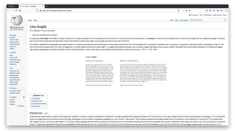
You usually don’t want this ‘content’ area to be the full width of the screen as it would make for really long line-lengths, which is bad for readability, and generally looks crap.
Think Wikipedia…
But often, we want to include full-width elements in our design.
For example, we might want a section to have a full-width background colour, or use a full-width image.
Without closing and reopening the container (yuck), we need a way to ‘break out’ of it instead.
How to break out of a container element
There are a few ways to do this, but the most robust that I have found is to use a combination of position and margin rules.
.full-width {
  width: 100vw;
  position: relative;
  left: 50%;
  right: 50%;
  margin-left: -50vw;
  margin-right: -50vw;
}
This generally works really well.
The hidden danger of this approach
However, on a recent project I found a problem with this approach.
Our client noticed that, when using a USB mouse, the page had a slight X-axis scroll.
I couldn’t see the problem at all and was finding it really hard to debug.
Eventually, we found a setting in the MacOS system preferences that could replicate the behaviour and reproduce the bug.
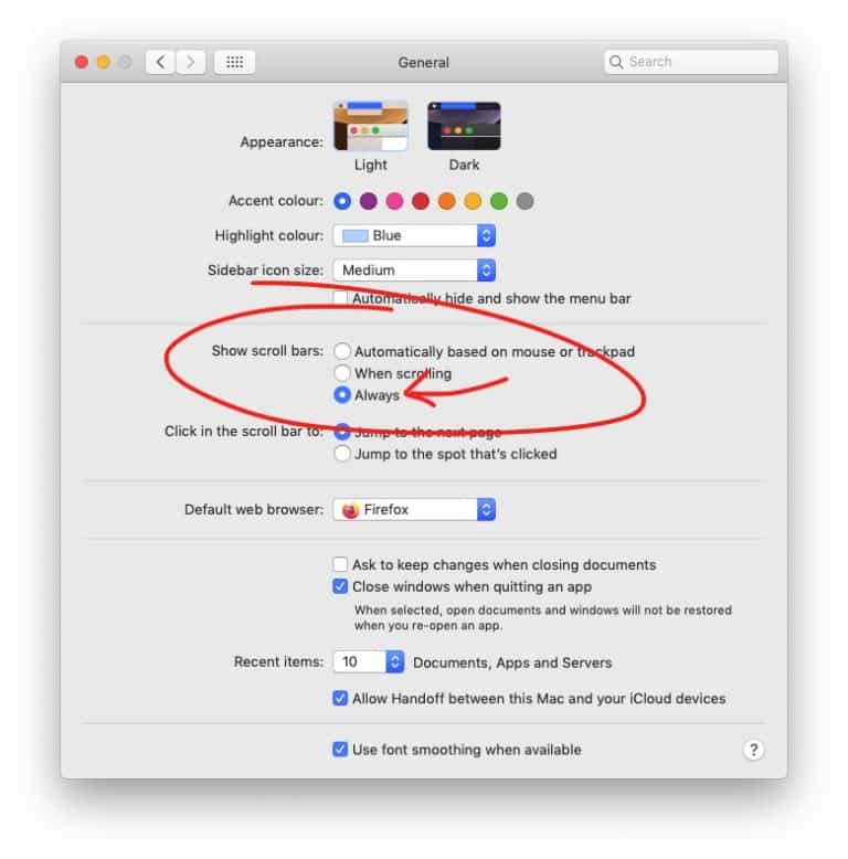
Setting the “Show scroll bars” option to “Always” forced the scroll bars that my client was seeing (when using their USB mouse) and allowed me to start debugging the issue.
Now we needed to figure out how to prevent the behaviour.
Fixing side scrolling issues when using 100vw and scrollbars
The problem was that when using viewport units, in our case 100vw, the width of the (fixed) scrollbar isn’t taken into account. Yikes.
The solution involves some CSS custom variables and JS (unfortunately).
Detecting the scrollbar width
The first thing that we needed to do was to detect the width of the scroll bar.
I can’t remember where we found this (apologies to the source), but the JS need is:
document.documentElement.style.setProperty('--scrollbar-width', (window.innerWidth - document.documentElement.clientWidth) + "px");This creates and sets a custom variable called `–scrollbar-width` which we can then use in our CSS like so:
width: calc(100vw - var(--scrollbar-width))Used in the context of our previous example…
Nice!
Now we can break out of containers to create full-width elements AND not worry about scrollbar issues. 😀🙌
One more gocha!
There was one more little issue that I faced while debugging all this.
At some point, I started positioning the full-width container with transform: translateX instead of using margins.
I think I did this because margins were being used already, I’m not sure.
Anyway, using transform: translateX(-50%)created rounding issues when the page width was an odd number of pixels.
This created a 1px gap along the left side of all of my full-width elements.
Watch the left-hand side of the grey, full-width container in the following video.
I don’t know why, but using margins instead of transforms fixed this for me.
The best solution?
All of this feels a bit hacky to me, which is why I started learning how to use CSS Grid to handle page layouts instead.
I’m currently trying to build a grid-based Gutenberg theme. It’s going well and I hope to blog about it soon.
If you have any questions about the article, please reach out to me on Twitter.