Multiply, screen, color-dodge, exclusion…
If you’re a designer or front-end developer, you’ve probably seen these before.
Blend modes are that long confusing list that you just scroll through until one looks right – usually ‘multiply’.
For a long time these were the domain of image editing software, like Photoshop, but you can use blend modes today in CSS to produce engaging visuals.
So, what are blend modes?
What are blend modes?
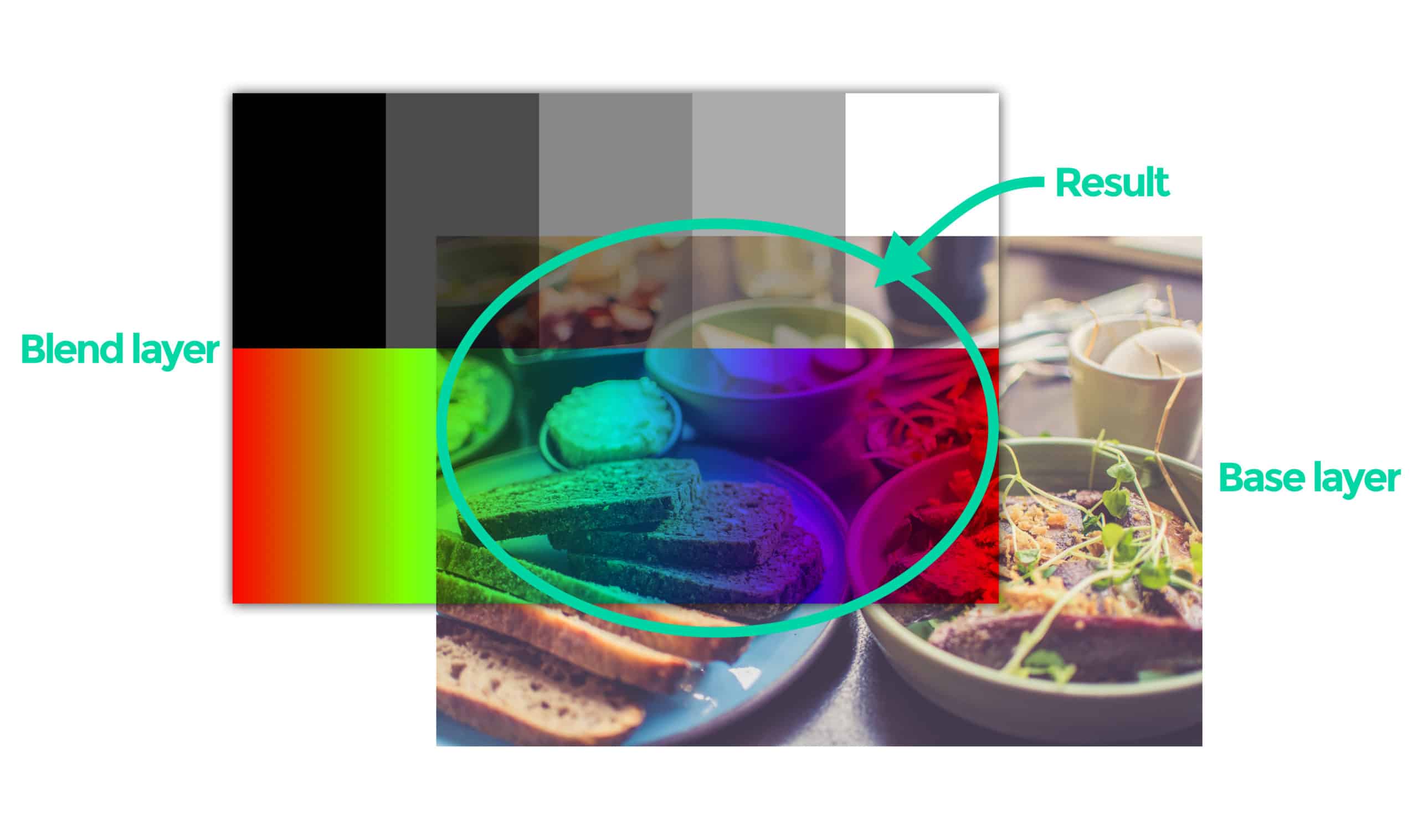
Blend modes are used to determine how two layers are blended with each other.
There is a base layer and a blend layer, and when combined they produce a specific result.
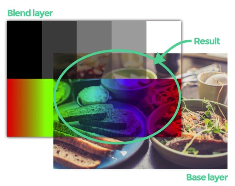
The blend mode determines the mathematical formula used to determine how the layers are blended.
WHAT ARE THE CSS BLEND MODE PROPERTIES?
What are the CSS blend mode properties?
In CSS, there are two primary CSS properties used for manipulating blend modes:
- mix-blend-mode
- background-blend-mode
Mix blend mode
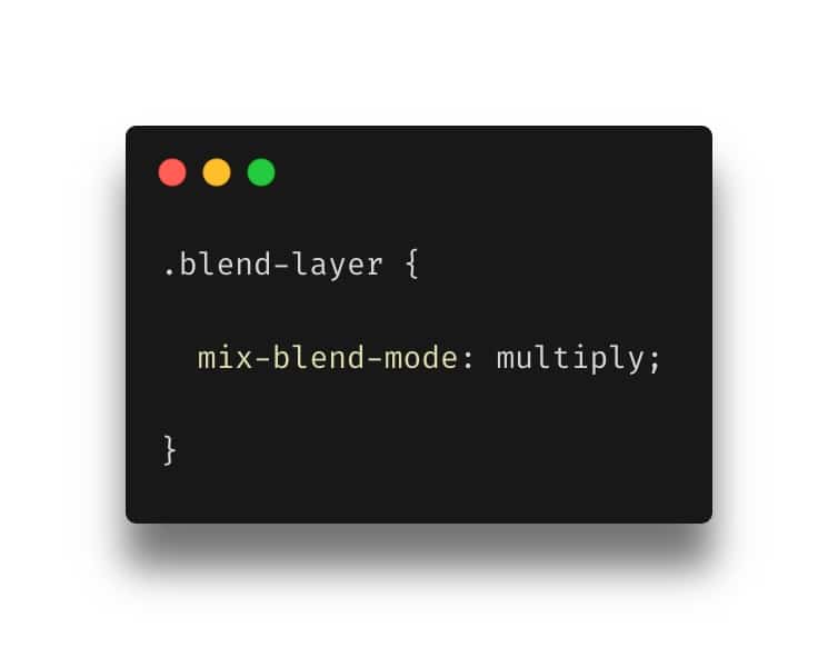
From Mozilla:
“The mix-blend-mode CSS property sets how an element’s content should blend with the content of the element’s parent and the element’s background.”
–https://developer.mozilla.org/en-US/docs/Web/CSS/mix-blend-mode
It can be used like so:
BACKGROUND-BLEND-MODE
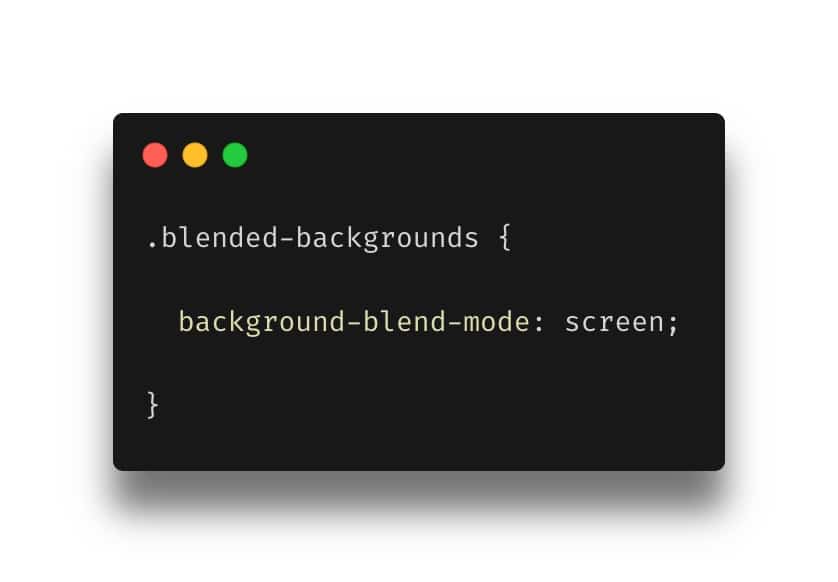
From Mozilla:
“The background-blend-mode CSS property sets how an element’s background images should blend with each other and with the element’s background color.”
–https://developer.mozilla.org/en-US/docs/Web/CSS/background-blend-mode
Here’s a simple example of blending a background image, with a linear gradient:
Note: background-blend-mode blends the backgrounds of a single element. It doesn’t blend two elements like mix-blend-mode does.
Using linear and radial gradients with background-blend-mode
As shown in the example above, using background gradients with background-blend-mode is a great way to add some visual interest to your backgrounds.
Remember, you can use multiple background images within the same ‘background-image’ property.
Multiple background blend modes
In addition to using multiple background images, you can also use multiple background-blend-mode declarations.
This can produce some really interesting effects.
Animating blend modes
One of the big advantages to using blend modes in CSS (as opposed to something like Photoshop) is that they can be animated.
A simple animation (in this case changing the background colour from red to blue) can result in some really interesting effects.
CSS blend mode values
OK, so we’ve seen what blend modes can do.
But what are the blend modes available to us?
This is where things usually get confusing. But I’m going to show you each of the blend modes, how they are categorised, and what they do.
Here goes.
Blend mode categories
There are six blend mode categories:
1. Normal
2. Darken (darken, multiply, color-burn)
3. Lighten (lighten, screen, color-dodge)
4. Contrast (overlay, soft-light, hard-light)
5. Inversion (difference, exclusion)
6. Component (hue, saturation, color, luminosity)
These are helpful in that they give us our first clue as to what each of the blend modes does.
For example, the blend modes in the ‘Lighten’ category (lighten, screen, color-dodge) will generally make images lighter.
It also helps to understand that some modes are the opposite of each other.
For example, ‘multiply’ and ‘screen’ are opposites.
Let’s have a look at each of the modes in turn.
For these examples, I’ve used the same blend and base layers so that you can easily compare the effects.
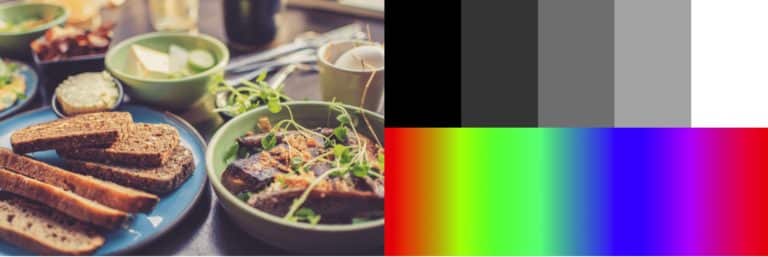
I’ll also show how these blend modes work at 100% and 50% opacity.
‘Normal’ blend mode
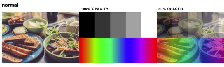
This isn’t technically a blend mode at all. It simply affects the transparency of the blend layer, revealing the base layer below it.
Darken blend modes
‘darken’ blend mode
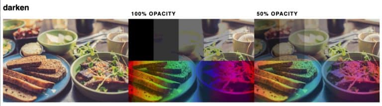
In this mode white is neutral. Anything that isn’t white will darken the layer below.
This creates an effect that both darkens and ‘fades’ the image below.
This mode looks best at lower opacities.
‘multiply’ blend mode

‘Multiply’ is my favourite of all the blend modes.
It combines the luminosity and contrast of the two layers.
Multiply always darkens the composite and adds contrast.
‘color-burn’ blend mode
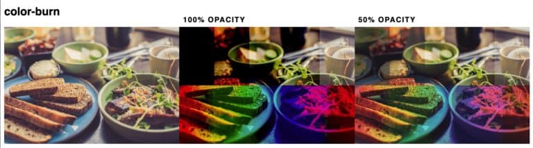
At 100% opacity black is completely dark.
‘Color-burn’ darkens the composite image by adding contrast and burning the colours down.
This results in a high-contrast, highly saturated, burned look.
It can be used to boost saturation and contrast in the 50% opacity range.
Lighten blend modes
‘lighten’ blend mode
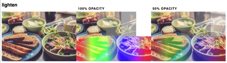
The first of the ‘lighten’ blend modes and the opposite to ‘darken’.
‘Lighten’ keeps the lightest of the base colour and the blend colour.
In this blend mode, black is neutral.
‘screen’ blend mode

‘Screen’ is the opposite of ‘multiply’.
This mode is similar to ‘lighten’ but removes more of the dark pixels and has smoother transitions.
In this blend mode, black is neutral.
Use ‘screen’ to brighten and reduce contrast.
‘color-dodge’ blend mode
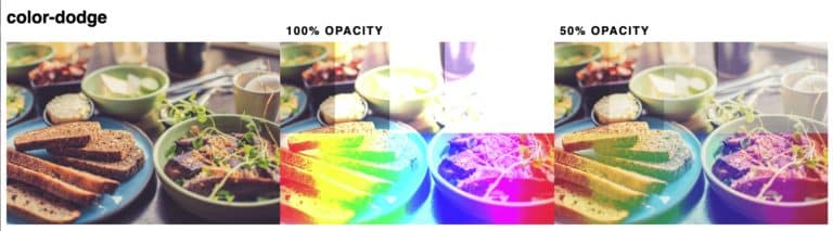
‘Color-dodge’ is the opposite of ‘color-burn’.
It brightens the image and adds colours.
It’s a powerful blend mode, so use at lower opacity for a more subtle effect.
Contrast blend modes
‘overlay’ blend mode

In this mode, 50% grey is neutral.
Anything darker than 50% grey will darken and add contrast.
Lighter than 50% grey will lighten and add contrast.
‘soft-light’ blend mode

‘Soft-light’ is similar to overlay but it’s softer with less contrast.
‘hard-light’ blend mode
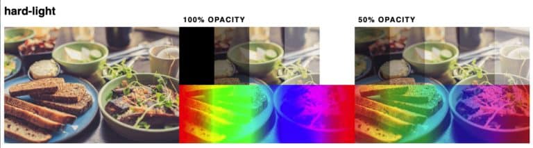
It’s similar to ‘overlay’ and ‘soft-light’ but much more aggressive. It will keep white 100% white and black 100% black.
Use at lower opacities for the best effect.
Inversion blend modes
‘difference’ blend mode
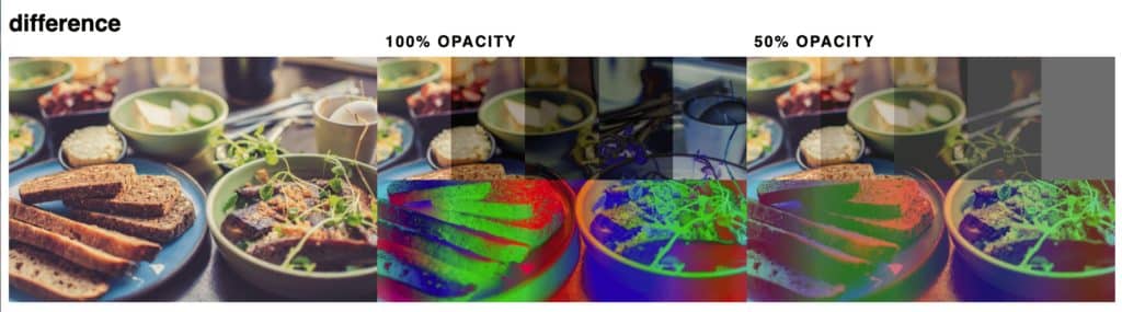
White inverts the colors of the base layer. Black Produces no change.
Dark grays apply a slight darkening effect.
‘exclusion’ blend mode

‘Exclusion’ is very similar to ‘difference’.
White inverts the colors of the base layer. Black produces no change,
But this time, unlike ‘difference’ 50% gray produces 50% gray.
Component blend modes
‘hue’ blend mode

‘Hue’ preserves the luminosity and saturation of the base layer and adopts the hue of the blend layer.
‘saturation’ blend mode

‘Saturation’ preserves the luminosity and hue of the base layer and adopts the saturation of the blend layer.
A black and white blend layer will result in a greyscale image.
‘color’ blend mode
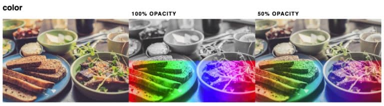
The ‘color’ blend mode preserves the luminosity of the base layer and adopts the saturation and hue of the blend layer.
This makes it ideal for colouring monochrome images.
‘luminosity’ blend mode
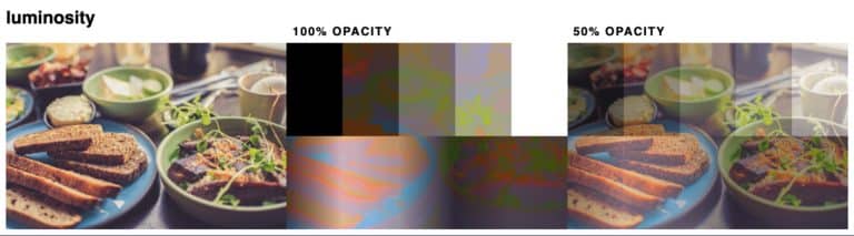
‘Luminosity’ preserves the hue and saturation of the base layer and adopts the luminosity of the blend layer.
CSS blend mode examples
- ‘Cut out’ text: https://codepen.io/abbeyjfitzgerald/pen/dNyYam
- Overlapping text: https://codepen.io/juliangarnier/pen/xOgyjB
- Colour picker: https://codepen.io/noahblon/pen/ZbjmbK
- Button background: https://codepen.io/giana/pen/PqVbRr
- Animated background: https://codepen.io/caraujo/pen/RWRbXQ
- Video background: https://codepen.io/ZachSaucier/pen/mVEwje
- Spotify style image filters: https://codepen.io/vailjoy/pen/OWVwvO
Browser support
Can you use CSS blend modes today?
The answer is probably yes!
Both background-blend-mode and mix-blend-mode have good, modern browser support.
However, these modes are not supported at all in Internet Explorer, so you’ll need a fallback for those browsers.
Progressive enhancement
There could be times when, if not supported, using a blend mode could completely or partially obscure some text or an important image.
Take care to test on browsers that don’t support these CSS properties and make sure to provide a usable and useful experience to those users.
This could be through using Javascript to test for support or using something like @supports in your CSS.
Conclusion
As you can see, CSS blend modes can produce stunning and very useful results.
They can be a bit tricky to understand but, hopefully, this article has helped to explain how they work, what they do and how to use them.
I highly recommend firing up CodePen and having a play!