One line-height rule for every font size in your block theme
Written by on July 17, 2026
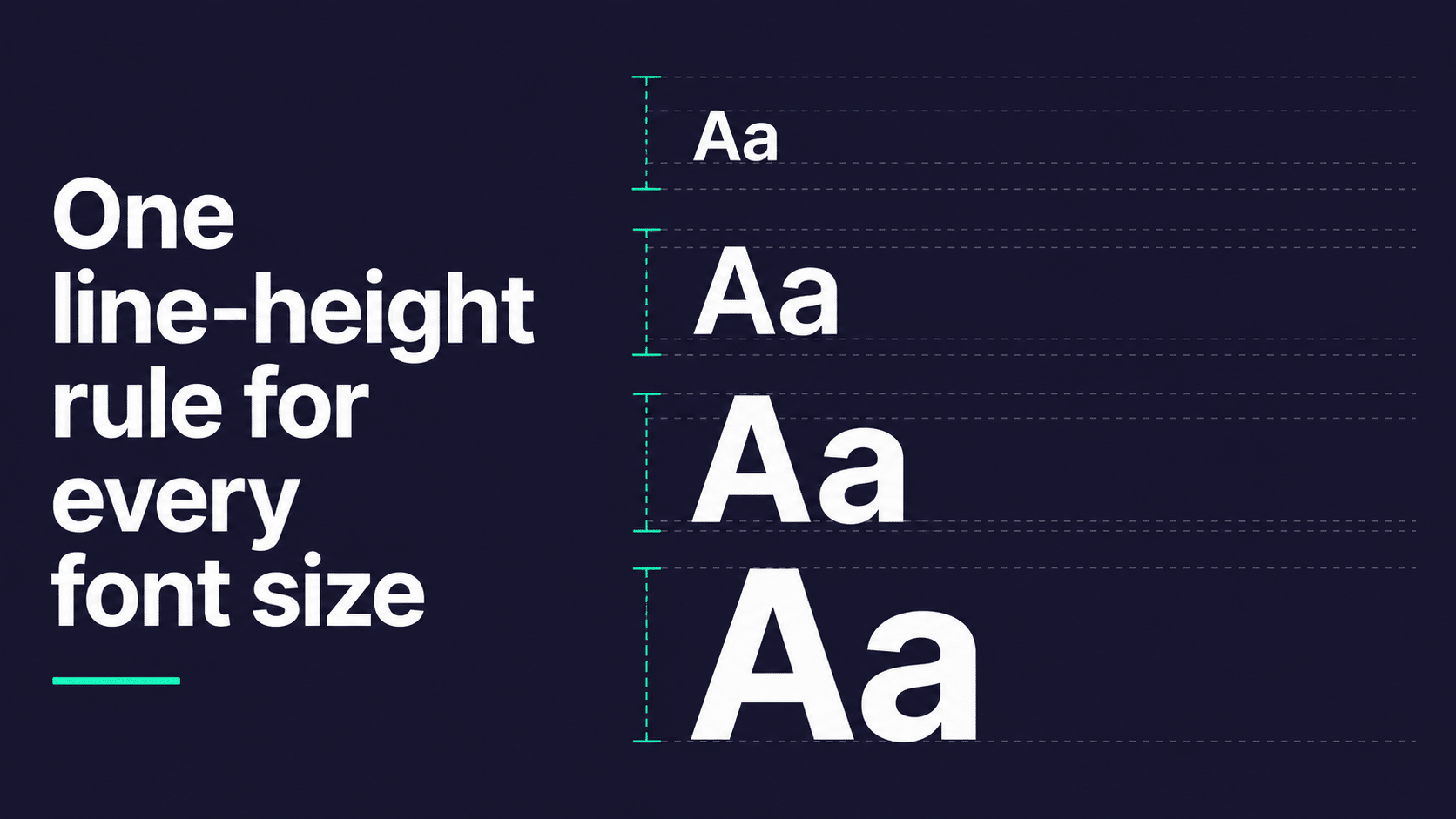
On a recent build we were setting up the typography for a block theme. The font sizes were sorted: fluid, clamped, all coming out of theme.json. Lovely.
Then we got to line-height, and it got messy fast.
Here’s the thing about line-height: there isn’t one good value. Body copy at 16px wants about 1.5. The same typeface at 48px wants about 1.15. Set your h1 at 1.5 and the lines drift apart like they’ve lost interest in each other. Set your body copy at 1.15 and nobody can read it.
So the space between the lines has to change as the type gets bigger. On a site where you control every font size, that’s easy. You set a value per size and you’re done.
The challenge
In a block theme, you don’t control the font sizes. Here’s what we were up against:
- Clients can resize any block. That paragraph might be small. It might be xx-large. Your CSS doesn’t get a say.
- Font sizes are fluid. A preset isn’t a size any more, it’s a range. Your x-large might be anything from 32px to 56px depending on the viewport.
- The custom size control exists. Someone types 27px into the box and WordPress puts no class on the block at all, so there’s nothing for your CSS to grab hold of.
- Sizes live in
theme.json, line-heights live in CSS. Two files, no connection, nothing keeping them in step. - Style variations can change the sizes underneath you and your line-height rules will carry on regardless, now wrong.
Which is worth caring about, because line-height is one of those things nobody compliments and everybody notices. Get it wrong and the site just feels a bit cheap, and no one can tell you why.
What we’re aiming for
So here’s what we wanted. A single rule that would:
- Give every element a sensible line-height, without us listing font sizes anywhere
- Tighten up automatically as the type gets bigger
- Work at every point along a fluid range, not just at the two ends
- Cope with a client picking any preset, or typing in a custom size
- Never need touching again when the type scale changes
That’s a lot to ask of CSS. Before we start, here’s where we ended up:
h1, h2, h3, h4, h5, h6, p, li, dt, dd,
blockquote, figcaption, caption, th, td, button {
  line-height: clamp(1.1em, calc(0.8em + 0.8rem), 1.7em);
}
That’s the whole thing, and it ticks every box on that list. It took me a while to understand why it works, and I think that bit’s genuinely interesting, so let’s go through it.
The obvious approach, and where it runs out
We didn’t start there, of course. We started where everyone starts, by setting a line-height per element:
h1 { line-height: 1.1; }
h2 { line-height: 1.2; }
h3 { line-height: 1.3; }
p  { line-height: 1.5; }
figcaption { line-height: 1.6; }
That works, right up until you remember that the block editor lets your client change the font size of any block they like. That paragraph might be small. It might be xx-large. Your p { line-height: 1.5 } doesn’t know either way.
So you start covering the presets. No need to do this per element, mind, because .has-x-large-font-size is the same size whether it lands on a paragraph or an h2:
.has-small-font-size    { line-height: 1.6; }
.has-medium-font-size   { line-height: 1.5; }
.has-large-font-size    { line-height: 1.35; }
.has-x-large-font-size  { line-height: 1.25; }
.has-xx-large-font-size { line-height: 1.15; }
That’s not much CSS, and it mostly works. But have a proper look at it.
As the font size goes up, the line-height goes down. Every one of those numbers is you doing the same sum in your head. What you’ve written is a function, typed out as a lookup table with five entries in it.
Which would be fine, if the type only ever came in five sizes.
The gaps between the entries
Here’s the bit that finished the approach off for us. Switch fluid typography on and your x-large preset isn’t a size at all. It’s a range:
font-size: clamp(2rem, 1.5rem + 1.5vw, 3.5rem);Anywhere from 32px to 56px, depending on the viewport. So what goes in .has-x-large-font-size { line-height: ? }. 1.25 is about right at 32px and much too loose at 56px. There isn’t a correct answer, because the question assumes a single font size and there isn’t one.
Five rules, five ranges, five numbers that are each only right at one point along their own range. And that’s before the custom size control, which gives you no class to hook onto whatsoever.
So the lookup table has gaps in it, and the gaps are where the type actually lives. What we wanted was the function itself, rather than five samples of it.
em resolves against the element’s own font-size
This is the lever, and it’s easy to miss because em behaves differently here than it does almost anywhere else.
In most properties, em resolves against the inherited font-size. In line-height, it resolves against the element’s own computed font-size. Which means the element can do maths on its own size.
Let’s start with the simple version, before we get to the clamp:
line-height: calc(1em + 0.5rem);Two terms, doing two different jobs. The 1em scales with the element’s font-size. The 0.5rem doesn’t, it’s a flat 8px at a default root, no matter how big the type is.
So every line gets exactly 8px of extra space. What changes is how big a share of the line that 8px represents.em term tracks the font size. The rem term is a flat 8px at every step.
Put that into numbers, with F as the font size and a 16px root:
line-height = F + 8px
ratio       = (F + 8) / F
            = 1 + 8/F
The ratio isn’t a constant. It’s 1 + (constant / font-size). As F grows, 8/F shrinks and the ratio falls towards 1, getting closer and closer without ever quite arriving. As F shrinks, it climbs.
| font-size | line-height | ratio |
|---|---|---|
| 12px | 20px | 1.67 |
| 16px | 24px | 1.50 |
| 24px | 32px | 1.33 |
| 32px | 40px | 1.25 |
| 48px | 56px | 1.17 |
| 64px | 72px | 1.13 |
And that’s the direction we wanted, for free. Small text gets proportionally more space between its lines, because the lines are long relative to the letters and the eye needs help finding its way back to the start of the next one. Display type gets less, because it doesn’t.
Notice how much faster it changes at the small end, though. Between 12px and 16px the ratio drops by 0.17. Between 48px and 64px it only drops by 0.04. And nothing ever stops it climbing: at 8px you’d get 2.0, and at 4px you’d get 3.0. That’s a problem we’ll come back to.
Have a play with it
This is the bit that made it click for me, so I’ve made it pokeable. Untick “apply clamp” first, so you can see the raw formula on its own. Then:
- Drag rem const down to 0. Every ratio collapses to the same number, which shows you the constant is doing all the work.
- Drag it up to 1.2 and the caption sails up past 2.6, while the h1 only creeps from 1.17 to 1.4. Same change, wildly different effect, depending on the size.
- Now tick apply clamp back on. The whole small end pins at 1.7 and the h1 carries on untouched. That’s the runaway end getting fenced off without the middle being disturbed.
- Tick line boxes. The white gaps between the strips are the space between the lines, and at the default settings they stay a constant 8px all the way down while the strips get taller.
Adding the clamp
That runaway small end is what clamp() is for. There’s one catch: clamp() won’t mix a number with a length, so this is invalid and gets thrown away silently:
line-height: clamp(1.2, 3vw, 1.5); /* nope, 3vw is a length */Go all-length instead. Since em in line-height means “multiples of my own font size”, 1.1em is a ratio of 1.1. Handy.
line-height: clamp(1.1em, calc(0.8em + 0.8rem), 1.7em);Those are the numbers we settled on after a lot of fiddling with the demo above. Note the number in front of the em is 0.8, not 1. When I worked out where each bound actually engages, something surprising turned up.
The bounds bite at 14.2px and 42.7px, which means the formula is only doing anything across the middle. And the middle is exactly where your body copy and most of your headings sit.
So it isn’t really a falling curve with safety rails bolted on. It’s a smooth slide between two ratios we picked by eye, with sensible flat bits at either end. I hadn’t planned that, it just fell out of the numbers that looked best, but I like it more than the textbook version where the clamp never does anything.
Gotcha: the clamp is load-bearing
Because that first number is 0.8 rather than 1, the raw formula doesn’t level out at 1.0 like the earlier version did. It sails straight through it. At 64px you’d get a ratio of exactly 1.0, and above that you’d get less than 1, which means the lines start overlapping each other.
So the bare calc() looks like the tidy, simplified version of this declaration and it absolutely is not. Take the clamp off and your headings break. Leave a comment in your CSS saying so, because the next person along (which is usually me, six months later) will try to tidy it.
The trap that got me: inheritance
This one cost me an afternoon, and it’s the reason people try this technique and then abandon it.
A unitless line-height inherits as a number. Every descendant recomputes it against its own font size. That’s why body { line-height: 1.5 } works the way you expect.
A line-height with a unit inherits as a computed length. So if you put our rule on body, every child inherits the resolved pixel value from the body font size. Your headings get spaced for body copy, and the whole thing defeats itself.
Here’s the same declaration in two places. The only difference is the selector:
on the card
Applications close in April
Children inherit the container's resolved pixel value, so the heading is leaded for 14px body copy and the caption is leaded for a heading it hasn't got.
Photograph: Kimbolton School
on the elements
Applications close in April
Each element resolves the em against its own font size, so the heading tightens, the body stays open and the caption gets the most air of the three.
Photograph: Kimbolton School
Look at the ratio on that first heading. It’s under 1, so the lines are actually overlapping.
The good news is that this gives us a simple rule, and once you’ve got it the technique is safe.
Where to put it
Never on a container. Not :root, not body, not a wrapper, not a block container.
This is what makes the whole approach safe, actually. Because nothing above the element sets a length, an element you forget to list doesn’t inherit something wrong. It just falls back to whatever it had before. So the failure mode is “not in the system yet”, which you’ll spot in review, rather than “silently broken”, which you won’t.
Block-level elements only. No span. An inline element adds its own spacing into the line it sits on, so a span with a different line-height to its parent will fight with it, and you’ll get one line taller than its neighbours wherever a highlight lands.
And here’s the nice part: for inline children, length inheritance is exactly what you want. Given <p>text <small>small</small></p>, the small should sit in the paragraph’s line box rather than compute its own. Inheriting the paragraph’s resolved pixel value is correct. The behaviour we were treating as a bug is doing us a favour here.
A couple of caveats
It’s tuned to one typeface. How much room type needs depends on its x-height, which is the height of a lowercase “x” compared to the full size of the font. Two faces set at 48px can look completely different sizes, because one has tall lowercase letters and the other has short ones. The tall one looks bigger, so it wants more room between its lines. Our 1.1 on a big x-height sans isn’t 1.1 on a small x-height serif. The formula travels between projects, the numbers don’t.
I went a long way down a rabbit hole trying to automate this, and came back out again. For nine sites in ten, one set of numbers across every family is fine and you’d struggle to pick the difference in a blind test. When a site really does need it, one token and one line will do:
:root { --hd--lh-k: 0.8rem; }

h1, h2, h3, h4, h5, h6, p, li, dt, dd,
blockquote, figcaption, caption, th, td, button {
  line-height: clamp(1.1em, calc(0.8em + var(--hd--lh-k)), 1.7em);
}

/* only where a face actually needs it */
.has-source-serif-font-family { --hd--lh-k: 0.65rem; }
Bind that token to the font family, never to the font size. Size is already handled by the em term, and that’s the whole reason it’s there.
The rem term is tied to the root font size. If a visitor sets their browser default to 20px, the constant grows by 25%, and so does the range of sizes where the formula does its work. Any font size that also scales by 25% lands in the same relative spot, so the ratio holds. Rem-based sizes scale with the root, and that includes WordPress fluid presets, so in practice this works out fine. Just don’t hard-code any font sizes in px and expect the ratios to hold.
Wiring it into a block theme
Put the rule in your theme’s stylesheet, not theme.json. I tried it in theme.json first and it’s more trouble than it’s worth:
styles.typography.lineHeightat the top level lands onbody, which is a container, which is the exact thing we can’t do.styles.elementsonly covers headings, links, buttons, captions and cite. Paragraph, list, quote and table are all blocks, so they live instyles.blocksinstead.- Anything left over needs
styles.cssanyway.
That’s three config surfaces for one property. Let theme.json do what it’s good at, which is presets, and put this one rule in CSS.
One genuinely nice thing: if you’ve left settings.typography.lineHeight enabled, the editor’s line-height control writes a unitless number inline. Unitless beats our length on specificity and inherits properly to children, so a client override is a clean exit from the system rather than a half-broken hybrid. That’s about as good as an escape hatch gets.
Worth remembering when someone reports that one card looks different, mind. Check for an inline style="line-height:1.5" before you go debugging the maths.
Should you use this everywhere?
If a project has a fixed type scale of six or eight steps and the client can’t change font sizes, hand-set six unitless numbers. They inherit correctly, they survive theme.json round trips, they’re obvious to whoever picks up the codebase next, and they let you make per-step judgements no formula can. The clever version buys you very little there.
Where it earns its keep is exactly the situation we were in: fluid type, an editor full of font size presets, and clients who use them. That’s most block themes we build. It’s also handy across multi-brand setups, where a shared structure has to cope with different type scales without a per-brand line-height table.
The full CSS
And that’s it. Here it is in full:
/* Reverse-scaling line-height.
 *
 * ratio = 0.8 + 12.8/F, clamped to 1.1–1.7.
 * The gap between lines tightens automatically as the font size
 * grows, so this covers every element and every font size preset
 * in one rule.
 *
 * Two things to leave alone:
 *
 * 1. The clamp is load-bearing, not a safety net. Because the em
 *    multiplier is 0.8 and not 1, the raw calc() drops below a
 *    ratio of 1 above ~64px and the lines start overlapping.
 *    Don't "simplify" this by removing the clamp.
 *
 * 2. Never move this to a container. A length line-height inherits
 *    as a resolved pixel value, so children would stop recomputing
 *    it against their own font size.
 */
h1, h2, h3, h4, h5, h6, p, li, dt, dd,
blockquote, figcaption, caption, th, td, button {
  line-height: clamp(1.1em, calc(0.8em + 0.8rem), 1.7em);
}
Two lines of CSS and a comment block four times longer than the rule. No lookup table, no gaps.
I hope you found that useful! If you have any thoughts, criticisms, or improvements please let me know.