A post about branding and teamwork
Over the past couple of months we’ve been working to set up our new company. We’re really keen to get started, and the journey to this point has been exciting and fun – mostly.
I (Keith) have been working for myself for over 6 years now. I’ve always had that entrepreneurial spirit that meant full-time employment wouldn’t be a good fit – and freelancing gave me the freedom that I craved.
The autonomy comes with its drawbacks though. It can get pretty lonely. You don’t have anyone to share your highs and lows with. There’s none of that spark that comes from creative tension and collaborative thinking.
That’s where branding comes in.
In late January Mark Wilkinson and I decided to go into business together. We’ve been working together for over a year, and with our complimentary skill-sets and areas of interest – it was a logical progression.
First thing on the agenda – our positioning, i.e. what we’ll do, who we’ll do it for, and why we’re unique. We decided that we want to be the WordPress development partner for design agencies, and businesses who already have a design partner. And that we want to position ourselves as the ‘real deal’, not the cowboy WP devs that so many of our clients come to us from.
Once that was agreed, we needed to get some branding done. Now, I know that this isn’t the next most important thing to do. I know that people put too much stock in logos and visual design, but we needed to get a website up, to get business cards printed, etc. so we needed something, and fast.
The name game
Coming up with a company name is hard. Really hard.
We both came into the discussion with names that we were attached to. Eventually I came around to Mark’s idea. (I won’t put it here because we might use it for something in the future). But when I started telling people the name, no-one ‘got it’. It wasn’t the hit that we’d hoped. Back to the drawing board.
We both spent hours coming up with other names, usually to find that the domain names were taken already. We kept coming back to Mark’s idea, and kept getting put off it again.
Then we thought – we’re both tall, what about something to do with that? ‘Lanky studios’? Nah. ‘Code Heights’. Hmm…not quite.
We were sitting on the tube, when I turned to Mark, “What about Highrise Digital”? “Ooh, that’s got a good ring to it” we both thought. “I bet it’s taken”, I said.
Immediately, I took out my phone, loaded up Domainr, typed in the name, and there it was – all the domain names were available. .com, .co.uk, .net, .org, and .digital.
highrise.digital – we liked it.
Logo no-go
Almost immediately our next thought was a logo. WordCamp London is coming up and we’d already bought sponsor tickets, so we needed something to put up there.
Our first experiment was Fiverr. I commissioned three designers to come up with a logo for us, and paid them each about £7. Ridiculous, I know. But we wanted to explore some concepts quickly, and cheaply.
The results were OK. Actually, one was pretty terrible, but the other two were passable.
Next, we came up with a few ideas ourselves. Using Sketch, we threw together some simple ideas, and again, we got close, but still it wasn’t quite right.
Bringing in the professionals
We soon realised that we needed professional help. A tweet was sent out asking for referrals and we got this:
@keithdevon A gazillion votes for @AdamWhitcroft or @FHOKE /cc @miss_jwo
— Christopher Hoult (@choult) January 29, 2016
We looked at both, but the work from the guys at FHOKE really caught my eye. Their communication with us was top notch too. Really professional and enthusiastic – exactly what we hope to be like for our clients.
After a bit of thought around spending so much money at such an early stage we decided to go for it.
Round one…
I never thought that we’d be a nightmare client.
Having working in professional services for a while now, I like to think that I know what being a ‘good client’ looks like. But we’ve really tested the patience of Brett at FHOKE!
When we received the first round of designs we had mixed reactions. I loved most of them and was really excited, but Mark wasn’t so keen, and was a bit disappointed.
We went round and round, and back and forwards in our discussions. I would come up with all kinds of reasons why the one that I liked was ‘the one’, and Mark would counter with reasons why it wasn’t a good fit.
Neither of us were wrong – the problem is that there’s no ‘right’. Mark’s opinions were just as valid as mine. So what could we do?
We asked for another round of changes, but unfortunately that didn’t really get us any closer. To be fair, our feedback wasn’t clear, and Brett was having to design a logo for two people with different tastes!
We talked a bit more and tried to get to the bottom of our feelings – it’s hard to put these things into words – but we had to try.
Mark’s main reservation was that the logo was too aggressive. This knocked my confidence. “He’s right”, I thought. The sharp angles, the colour – it was aggressive – and that’s not the image that we wanted to portray.
But I saw it differently. I saw positive connotations like ‘security’, ‘protection’, and ‘super hero’.
So we worked together to soften the logo and make it more friendly. I think it worked. Mark still wasn’t so sure – but, showing great humility and maturity – decided to leave the decision up to me.
Another round from Brett and we were done.
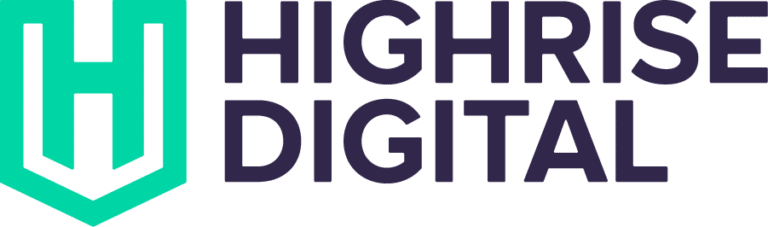
So what does the branding say about us? At the logo’s core is the ‘H’ for Highrise. It’s wrapped in a ‘shield’ which speaks of ‘security’ and safety’, as in ‘a safe pair of hands’.
The top of the logo echoes a skyline with high rise buildings, and has two tall buildings (Mark and I).
The shield also has a ‘super hero’ look. We’re often brought in to rescue WordPress projects that have gone wrong – so this felt appropriate too.
The green was used to soften the branding, making it a bit more friendly and accessible. This is also achieved by the rounded typography.
Final thoughts
We’d highly recommend working with the guys at FHOKE. They are patient, professional, and very talented.
I’d like to say that we’re 100% happy with what we have, but the truth is that we probably never will be. With different tastes, it was always going to be a challenge.
My big lesson from this is the power of collaboration. If I was on my own, I probably would have picked something from the first round of designs, that might not have been wholly appropriate.
The creative process can be difficult, especially when your ideas are challenged, but if you can maintain mutual respect and an open mind, working with others can be very rewarding.
I’m really looking forward to sharing the journey ahead.