17 essential elements for high performing job pages
Written by on January 30, 2023
This post covers everything you need to know about writing the best recruitment website job pages, including what information you should display to make the most of the jobs on your site.
The job pages on your website are very important as they are likely the first point of contact a candidate has with your site and first impressions are everything!
The information you include and the layout you choose for your job pages can be critical to the success of you job board.
Below are 17 essential elements that you should consider including in your job pages, along with some examples of excellent practice.
Table of Contents
- Use a clear, easy to understand job title
- Make sensible use of bullet points
- Include a clear call-to-action on the page
- Always include salary information (if you can)
- Ensure the advert looks good on mobile
- Provide an easy way for candidates to ask questions
- Add consultant information
- Break the job description into sub headings
- Summarise key information
- Highlight where a job is remote, or available for remote work
- Make the application process clear (and easy!)
- Show similar roles
- Include related content
- Add structured data to your job advert pages
- Register CV
- Social sharing images
- Job alerts
- Conclusion
Use a clear, easy to understand job title
Recently, there are so many job titles that it can be hard to find what you’re looking for.
Candidates are experiencing similar problems when they are searching, as most candidates are going to search for tried and tested job titles.
For example, don’t call your product support role a “Happiness Engineer”. It sounds quirky, but it’s not what candidates are searching for and therefore your role is less likely to be returned in the search engine results.
Think about what keywords or search terms a candidate will use and then use that as the job title.
Also, don’t ram your job title full of job data like salary, location, etc. Keep it brief and to the point, the other data can be added and displayed elsewhere.
Why? Because it makes your job posts much more scannable on your website.
Make sensible use of bullet points
Bullet points make it easy to scan down the page and see the relevant points.
Breaking certain sections of the page into shorter bulleted lists make sense as it is easier for candidates to digest key information quickly.
For example, when outlining the role and responsibilities, it makes sense for this to be a list and makes it easier to scan.

Include a clear call-to-action on the page
The candidate has landed on your job advert and therefore if they are the right candidate for the role, you want them to take some form of action.
Most of the time this is likely to be to apply for the job so this should be your main call to action. However it could be something else, for example asking questions about the role.
Make sure that your main call to action is clearly visible on the page in more than 1 place. For example as the candidates scroll down the page, the call to action may disappear, therefore there is no harm in placing it further down the page too. Or the call to action could follow the user down the page.
A good example of this is adding an apply button to the top of the page which scrolls down to the application section.
Don’t forget, a page should only have 1 (or maybe 2) calls to action, don’t overload the candidate with too many choices on the same page.
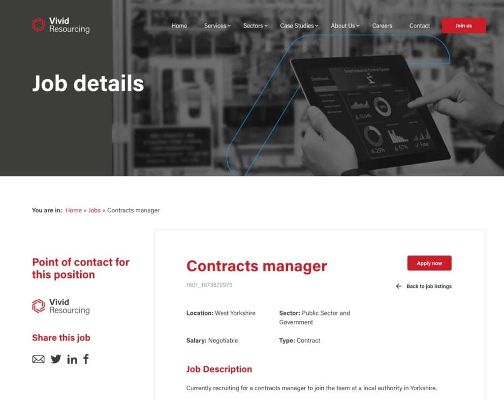
A nice example of this is the Vivid Resourcing website. A clear “Apply now” button is placed next to the job title, clearly indicating to the candidate what the next course of action is.
Always include salary information (if you can)
Many job adverts don’t include salary information which is not the best way of attracting good candidates.
Adding the salary, or at least a salary range has many benefits:
- Helps attract the right candidates – by adding the salary, you’re filtering out the those who are not a good fit for the position, whether that is because they expect more or less compensation.
- Reduces wasted admin time – if you have candidates applying that are clearly not aligned with the salary being offered, because the salary wasn’t advertised, this wastes a lot of admin and candidate time.
- Builds trust – transparency and honesty from the very start of the hiring process helps build valuable trust with potential candidates.
- Less time wasted on negotiations – when no salary is provided, inevitably there is a salary negotiation. Having a salary or a salary range helps this negotiation move faster, or removes the need for it completely.
- Provides you with a competitive advantage – adding clear salary information to your job adverts means you immediately stand out from the others, providing you with a competitive advantage.
There is also clear evidence to back this up.
The UK Candidate Attraction Report from 2021 – 2022 concluded that candidate quality and quantity reduced on all channels when no salary information was provided.
When salaries are not advertised there is a shift to the left
UK Candidate Attraction Report 2021 – 2022 – eploy
and down (reduction in quantity & quality) – and quite significantly too…
Ensure the advert looks good on mobile
Mobile first web design has been an industry standard approach in the web development world for a number of years now.
That said, I still come across recruitment agency websites that have great looking pages on desktop only to be let down on devices with smaller screen sizes.
Potentially half, or more, of your visitors will be using smaller screen sizes. Think of commuters looking for a new job on the train, probably using a mobile device to do so.
Therefore make sure that your pages are functional, look good and certainly are not an after thought on smaller screen sizes.
[In 2020] 43% of users accessed recruitment websites from mobile devices – more than double the number recorded during the previous year.
Recruitment website trends benchmark report – Recwebs
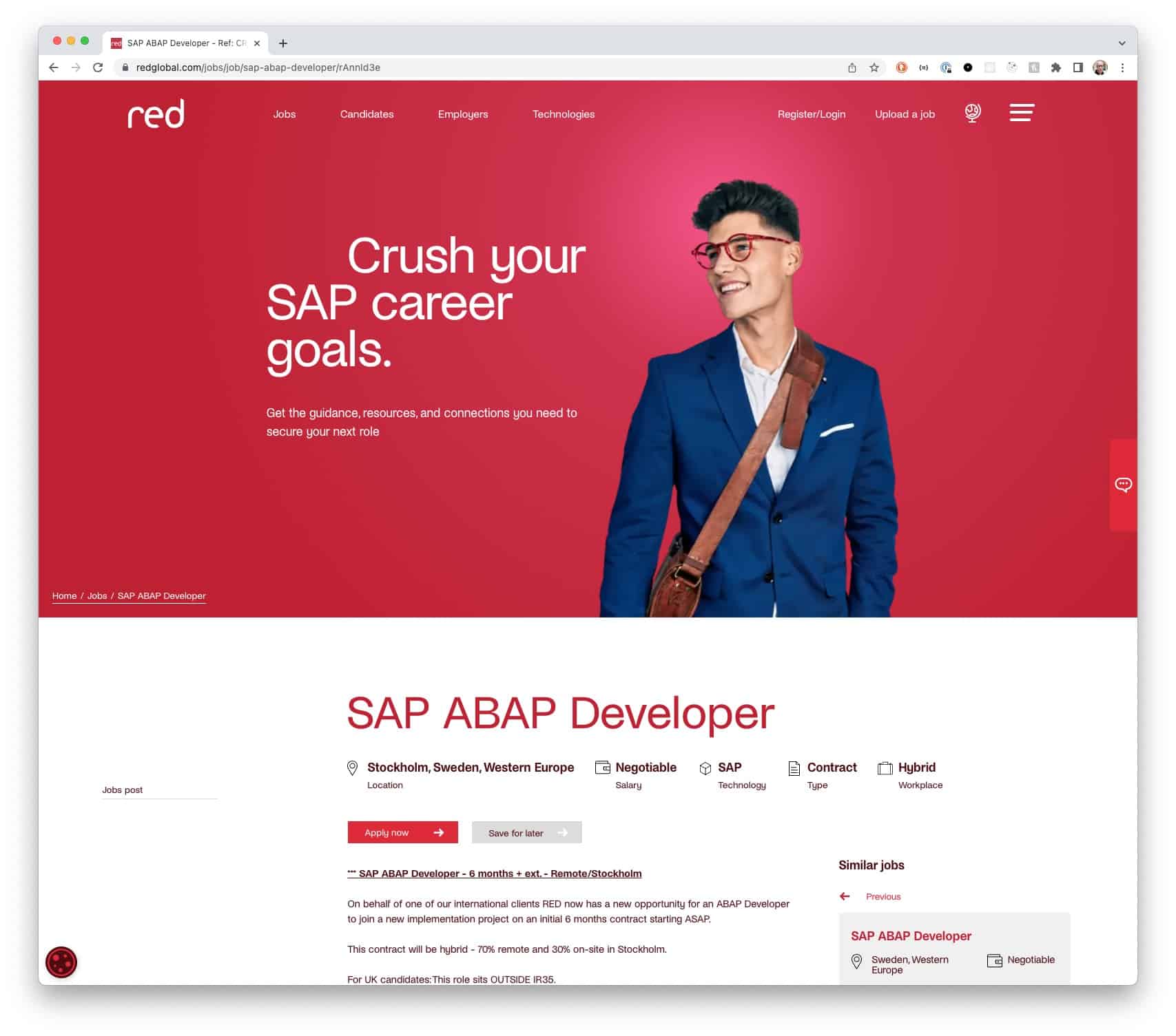
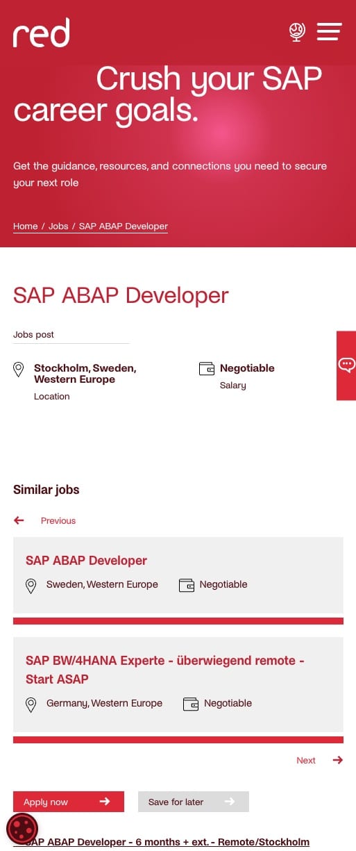
Below you can see a classic example. The desktop version looks nice, although the job title is a little too far down the page. However on mobile screen sizes, the similar jobs section is shown before the job description which is a little strange.
Provide an easy way for candidates to ask questions
I am always amazed with some recruitment websites how they don’t make it easy for a candidates to ask questions about a role.
How many times have you read a job advert and not had a single question? Not often I would imagine.
Make it easy for candidates to get the answers to the questions they have. The solution to this comes in 3 parts.
- The role – For example, the salary, benefits, location and working environment.
- The company – Questions about the hiring company, such as culture, leadership structure, and professional development.
- The process – Questions about the application process and what happens next.
Questions about the role need to be addressed by a member of your team, unless you can be more specific in the job description.
Think of questions that candidates might have and try to answer them on the advert page.
If you can’t give answers, then you should provide an easy call to action to allow potential candidates to ask questions. Live chat is often a good idea here, if you can staff that facility. Otherwise a contact form is good.
For other questions, think about providing an FAQ page which covers the most popular questions you have received from candidates and/or signpost other useful resources and content from your site.
Add consultant information
The recruitment business is a people business – people placing people. Therefore it is important to build those relationships with candidates.
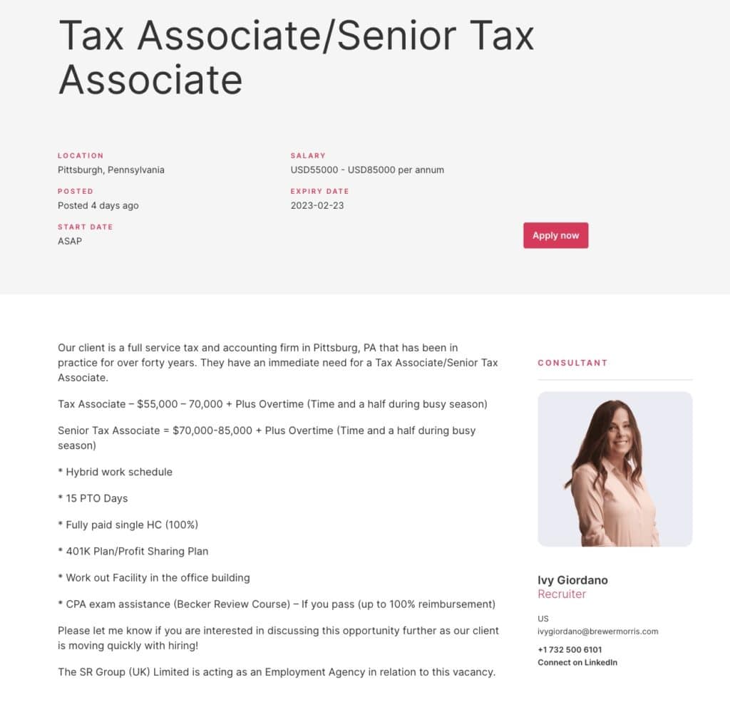
Make it clear on the job page who the consultant is who posted the job. This instantly provides a connection between the candidate and the recruitment company by showing who the candidate will be dealing with.
As well as showing a photo of the consultant (emphasises the person and helps build trust), add information about the consultant, notably contact details and links to relevant social accounts (LinkedIn is a must).
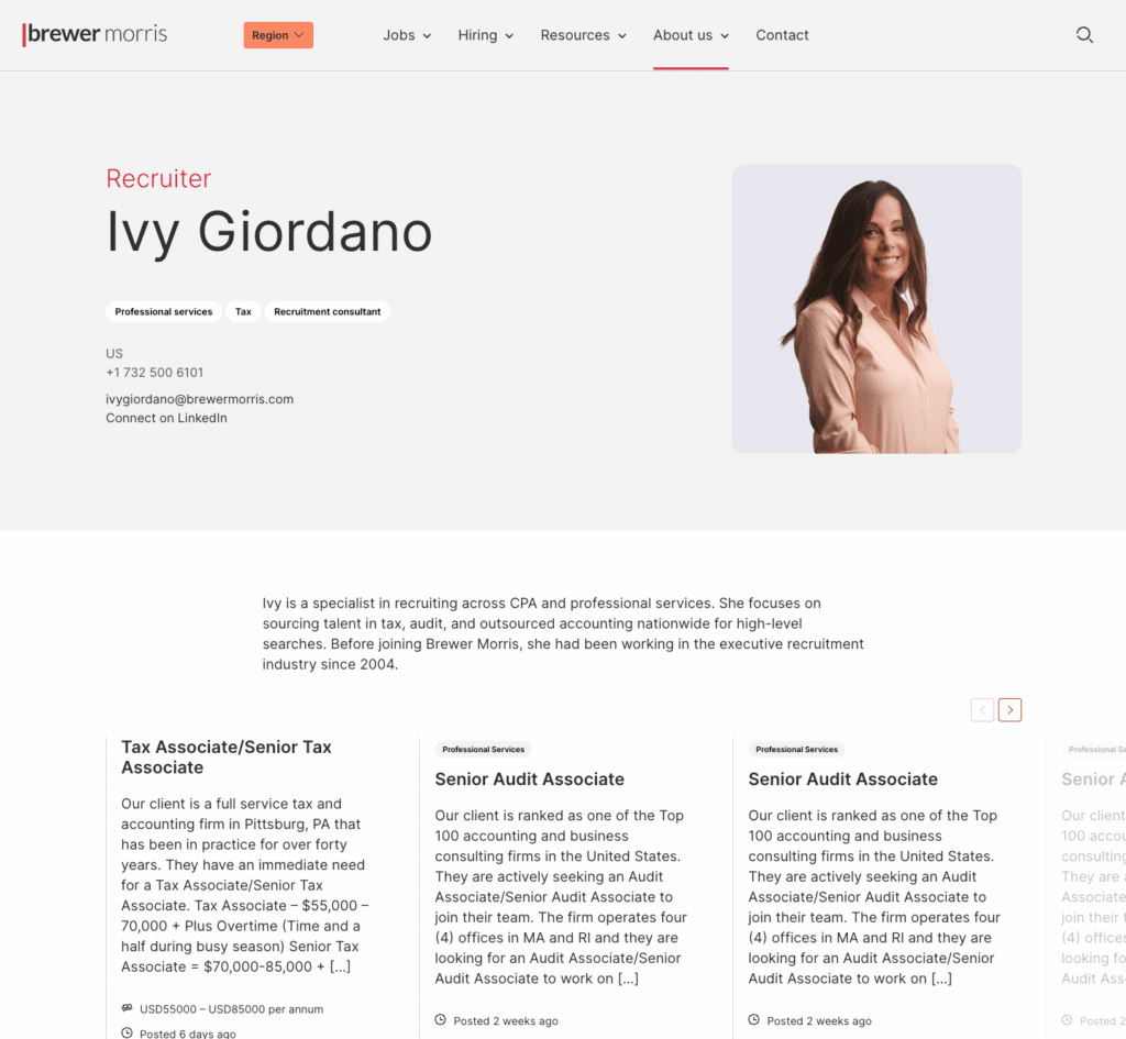
A good idea is to make the consultant name and/or photo a link to go to a page where the candidate can learn more about the consultant (their bio) and perhaps view other content written by them, such as other jobs or insights from a blog.
A great example of doing this well, is the Brewer Morris website. Alongside every job is a clear photo of the consultant, along with links to contact and follow them. Clicking on their photo takes candidates to a page all about the consultant.
Break the job description into sub headings
People hate reading large chunks of text, especially online. The best job adverts break the job description into smaller chunks.
This can be done with sub headings. I would suggest the following to get you started with your job descriptions.
- Job description
- The successful applicant / candidate profile required
- Benefits
- About the company
Inside each of these sections, use bullet points to show the key points about that section.
Summarise key information
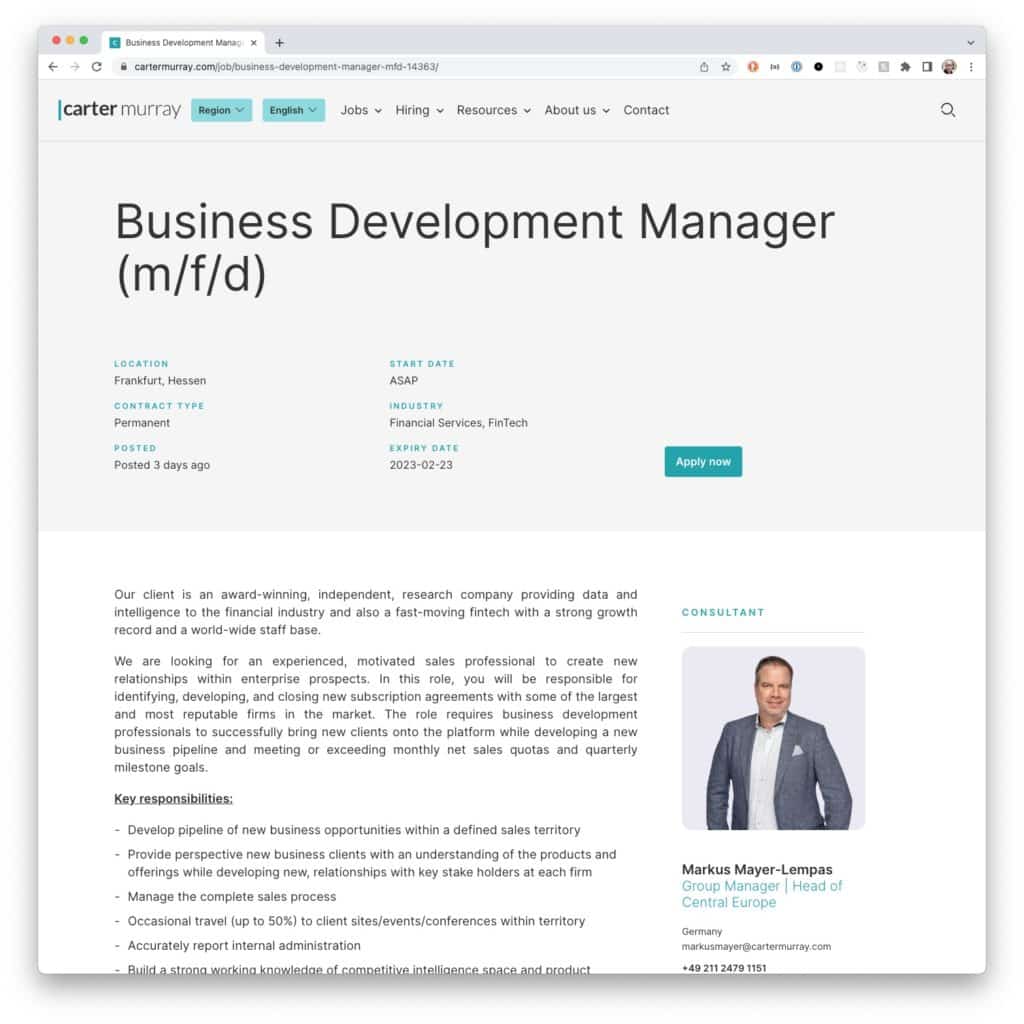
Summarise the key information for a job in a section of the page. This should include all the information that a candidate would want to know at a glance.
Maybe they have a couple of jobs open in different tabs on your site and they want to quickly compare information. Having this key information “at a glance” makes this easier.
I would recommend the following information is provided in summary, somewhere on the job page which is laid out in an easy to read way:
- Start date
- Reference
- Expiry date
- Consultant name
- Working arrangement (e.g. office-based, remote, hybrid, etc.)
- Sector/industry
- Location
- Salary
A good example of this is Carter Murray. At the top of each of their jobs they have the key information laid out beneath the title.
Highlight where a job is remote, or available for remote work
Since the pandemic in 2020, more and more candidates are looking for positions where remote work is at least an option.
Whilst candidate scarcity remains a massive challenge for both employers and recruiters, making remote jobs easy to identify is a great idea. By marking the job as remote, it opens it up to a wider range of candidates..
It’s frustrating to have to read through lengthy job descriptions to find out whether a role offers remote work.
To solve this problem, I would recommend having a “Working Arrangement” filter in the job search functionality. This will easily allow candidates looking for remote work to filter out jobs that don’t offer this.
Additionally, on the job advert itself, make it clear that jobs are either remote positions, office-based or that they offer hybrid working. This could be done in the summary section.
Make the application process clear (and easy!)
You’ve done the hard part by getting people to view your job post.
Don’t waste the opportunity by making the process too complicated or difficult.
In a candidate scarce market, applying for a job needs to be easy.
Too many recruitment websites have overly complicated application processes were candidates have to register with the site first before they can complete an application.
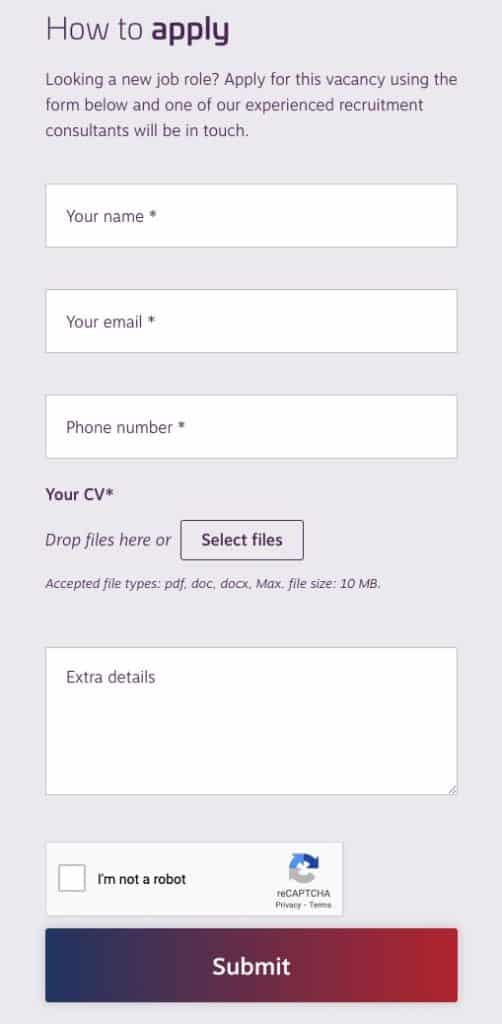
The best sites have a simple application form which requests the minimal information required to apply for the role. If the candidate looks a good fit, you can collect other appropriate information from them afterwards.
Once a candidate has applied, make sure they get a confirmation of their application. This should be both on screen and via the email address they used to apply. It provides peace of mind that the application has been received.
RE Recruitment is a good example of a simple application form, well designed that collects just the information necessary.
Show similar roles
For candidates looking for jobs on your site it is rare they find the best job for them on the first attempt. However, they will likely find jobs in the right sector and/or location quickly.
Therefore make it easy for them to find other jobs that may suit them. This can be done by offering them similar roles on the job advert page.
More often that not, this is usually jobs that are in the same sector and/or location as the job they are currently viewing.
Include related content
With candidates being scarce right now, it makes sense to offer potential candidates other related content which they will find useful. This can provide them with valuable insights and make you stand out from the crowd.
This could be in the form of insights about preparing for interview, getting a job or anything else that candidates looking for a role will find important.
What is even better is if the related content is directly related to the role they are currently viewing. Maybe information about the sector or current trends within that industry.
A popular and sensible choice for related content is to offer guidance and advice in the form of a download, collecting an email address first. Maybe a useful guide, a salary calculator or a white paper relevant to the role they are viewing.

Add structured data to your job advert pages
Adding structured data to your site makes it much easier for search engines such as Google to index your jobs, particular in Google for Jobs.
Structured data can be added in a number of ways. Whichever way you choose makes the information about the job easily readable by search engines and therefore gives you jobs the best chance of being indexed and showing in the search results, and therefore improving your job board SEO.
Register CV
You have a candidate looking for roles on your site but there is nothing quite right for them at this point. Rather than letting them leave with nothing, include a call to action, allowing them to upload their CV.
Once you have their CV in your system, you can then contact them if a suitable job should come about in the future.
Include the upload your CV call to action in your job listings page when a query results in no jobs being found.
Social sharing images
It is likely that consultants and candidates may well share the jobs on your website on social networking sites, particularly LinkedIn.
When they do, you want these jobs to have an impact in the feed, standing out amongst other jobs.
A good way to do this, is to make sure that each job has a social image set. This is a specific image that is set to be the image the social media feeds use when they display a link to the job.

Job alerts
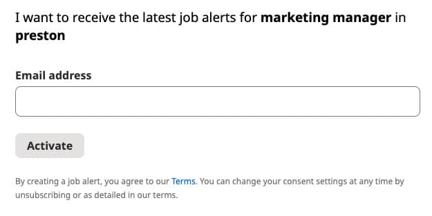
Another suggestion for when a candidate hasn’t found the right job, is to offer the ability for them to signup to a job alert. This ensures you can contact them should a job that suites them becomes available.
Adding a call to action to the jobs page to signup for job alerts encourages the candidates to provide you with their contact details.
These can then be used to match them with suitable jobs in the future.
Conclusion
Your recruitment websites job pages are one of the most important page templates on your site. They are used to attract your key audience, and should encourage them to engage not only with your advertised roles, but also with other content on your site.
Getting your job pages right can have significant benefits to your recruitment business. Following these essential tips should get your recruitment website standing out from the crowd.
Is there anything else you think should be included on the jobs pages? Let me know.
