Using WordPress to power a high-performance marketing site
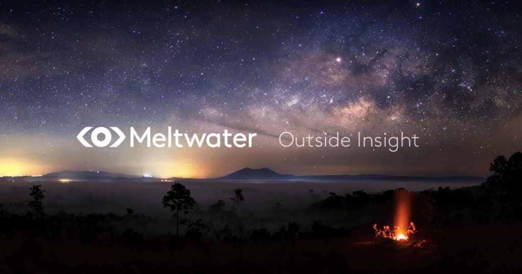
Outside Insight
Working with the marketing team at Outside Insight we took their design vision and developed a fast, robust and easy to manage marketing site that exceeded their expectations.

About Outside Insight
OutsideInsight.com is an online magazine and resource by the team at Meltwater. It helps executives understand how to bring AI-driven competitive insights into boardroom decision-making, and to evaluate case studies as events unfold in real time.
Challenges
Outside Insight (OI) already had a website but it wasn’t performing well as a marketing platform.
The key challenges that they faced were:
- Poor search rankings
- Difficulty building new content and landing pages
- Missing out on potential traffic from an AMP integration
Project goals
There were a few areas that OI identified where they wanted to see significant improvements over the previous version of the website. These were:
- Faster site speed – Achieve a Google PageSpeed score of 80+
- Media-rich – Extensive use of imagery and video
- AMP integration – The single blog posts needed to be integrated with Google’s AMP system
- Slick and smooth UI – The target audience are used to modern, impressive looking websites
- Easy, robust content management – Easy to edit without fear of breaking the layout or styling
Defining the scope
When Benjamin O’Dell (the Digital Marketing Manager at Outside Insight) initially contacted us we were immediately interested in the project. However, there were a lot of unanswered questions.
We pushed back on the brief and challenged Ben’s ideas to ensure the investment in their new website provides long-term value for money and is flexible enough to serve their business and its changing needs for the foreseeable future.
They pushed back on the loose spec and asked intelligent, leading questions which challenged us on what we were doing in order to create the quote.
Ben O’Dell – Digital Marketing Manager, Outside Insight
We then worked with Ben to develop a technical specification for the build covering as much detail as possible so that there we no surprises along the way.
The solution
Once we knew what Outside Insight needed from the website, and armed with the excellent designs that they provided, we were ready to start the development process.
The project can be roughly divided into these stages:
- Design breakdown
- Front-end build
- WordPress integration
- AMP
Global styles
We invested time in pulling out the common styles throughout the design. For example, we found commonalities in colour, typography, spacing, layout, etc.
Identifying these early on meant that we could incorporate them into our front-end processes, making the build much more efficient, lightweight and extensible. Essentially saving time and money now and in the future.
Building with blocks
The Outside Insight website was built using a block-based editing system.
‘Blocks’ are distinct patterns of layout and content. A page can be built up using any combination of blocks and these can be reordered, edited and deleted as necessary.
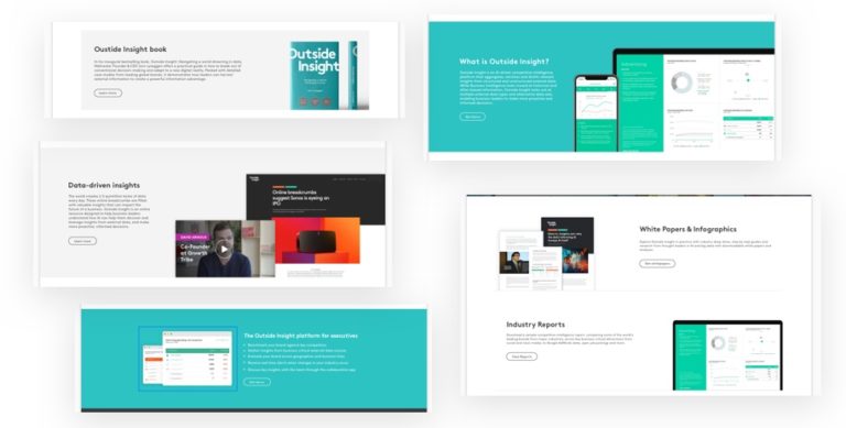
This gives OI much more flexibility when it comes to building page structures and using media-rich content.
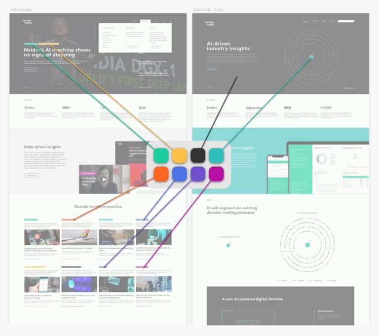
Dissecting the design
Our first major task was to split the design into ‘modules’ and ‘blocks’. There are obvious modules such as the header and footer, but the whole website was going to be based on a re-usable and flexible block-based system.
We went through the designs and split the content into blocks, block templates and one-off block variants.
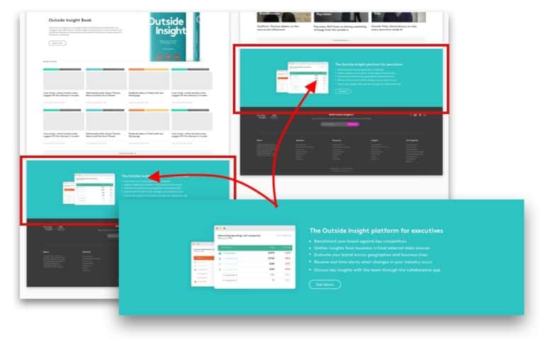
Example: “Feature row” block
For example, we noticed that there was a common pattern of text and images side-by-side, but that there were many variations of this.
We called this pattern a ‘feature row’ and created a ‘feature row’ block with multiple ‘template’ options to choose from for each of the variations.
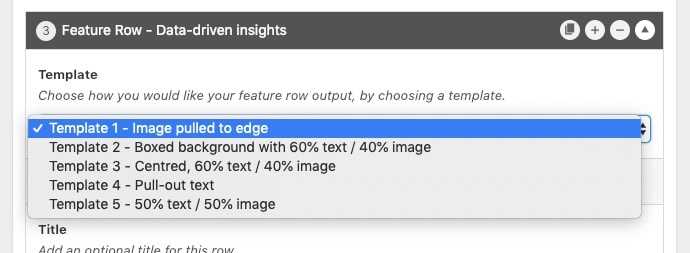
For one-off variations, we created custom classes. This was done to reduce the number of block and template options for the content editors so that they weren’t overwhelmed and could add content quickly and easily.
Re-usable blocks
We noticed early in the build that some pages shared common content. For example, call-to-action blocks at the bottom of the pages.
To save time for the content editors, we built a ‘global block’ system where you could create blocks once and reuse them throughout the site.
If these blocks are edited, the change is made across all pages. This means that it’s easy to keep content up to date without having to trawl through every page.
Front-end build
We knew from the first time that we saw the designs, and from the goals that had been set out, that the front-end side of the build would require our expertise and experience to produce a lightning-quick and slick website.
There were many different modules, with many variations, which all needed to work together in any order and on all screen sizes. The initial work on global styles and patterns were crucial to the success of this phase.
There were a few particular challenges that we enjoyed solving:
- Maximising page speed on an image heavy site
- Category colours
- Complex, responsive layouts
Maximising page speed on an image heavy site
We knew that the goal of high PageSpeed scores and the image-heavy design would be one of the hardest parts of the build.
Keith had completed some research for a WordCamp London talk on responsive images and knew that combined with ‘lazy loading’ techniques, we could serve appropriately scaled images at the right time.
The ‘trick’ is to show the smallest size of the image possible – and only when the user needs to see it. When the page loads initially, only the visible images are loaded. As the user scrolls, images load just as they are about to come into view.
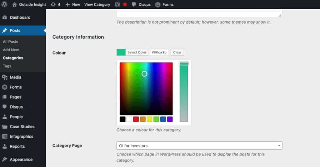
Category colours
Throughout the design, the different blog categories have specific colours associated with them.
The traditional way to achieve this would have been to output inline CSS throughout the code, which can significantly bloat the codebase.
We decided to use a modern CSS technique called ‘Custom Properties’ (or ‘CSS Variables’). Keith had covered it in his WordCamp London talk on ‘Future CSS‘.
We added a colour-picker to each of the category terms and created a custom property for each term, allowing us to easily use the appropriate colour wherever we needed to.
This also meant that in some modules the colours would be added automatically by selecting a post or category.
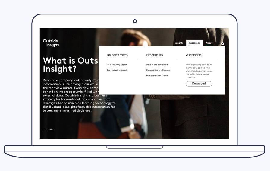
Dynamic header
The header of the site was one of the most challenging parts of the front-end build.
There are many different version for desktop, mobile, full-screen backgrounds, white backgrounds, etc.
On top of this, there is a ‘mega-menu’ system which is fully content managed.
One last feature is that if the menu is too wide it will ‘snap’ to the right of the grid so that it never goes off screen.
Complex, responsive layouts
There were a few layouts in the design that, although initially seemingly straightforward, ended up being quite challenging.
The main reason for this was the difference between the design and order of elements between smaller and larger screen sizes.
Using CSS Grid, with graceful degradation for older browsers, we were able to make use of modern CSS and keep the markup clean and accessible, whilst still achieving a flexible, responsive and robust layout.
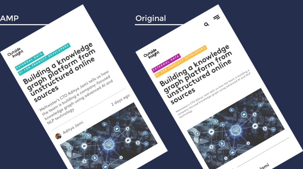
AMP Intergration
What is AMP?
AMP (Accelerated Mobile Pages) is a project by Google to improve the user experience for mobile visitors.
It’s a controversial system, but it provides very real benefits for ‘discoverability’ of content. Although Google says that it doesn’t affect organic search rankings, traffic is usually boosted due to the prominent placement of AMP pages in the search results pages (SERPs).
Outside Insight we keen to make use of this technology to increase the visibility of their blog posts.
How we turned WordPress pages into AMP pages
There is an official AMP plugin for WordPress which works well for very simple websites. However, with the complex design and data structures of the OI website, we needed a custom solution.
It turned out that an older version of the AMP plugin, with some customisations, was better suited to the job.
AMP element markup
AMP requires specific markup for certain elements (e.g. images) so we had to adjust our image functions to first detect if the page was an AMP page and then output the appropriate version.
Stylesheet
AMP only allows for 50,000 bytes of CSS. We created a separate stylesheet for the AMP pages. Knowing that AMP pages are for mobile devices, we could strip out the styling required for larger screen sizes. We were also able to remove some of the blocks that we knew wouldn’t be used on the blog pages.
The results
Although we loved working on this project, the proof is in the pudding and we’re most excited by how the site is having real, tangible benefits to the Outside Insight marketing team and business as a whole.
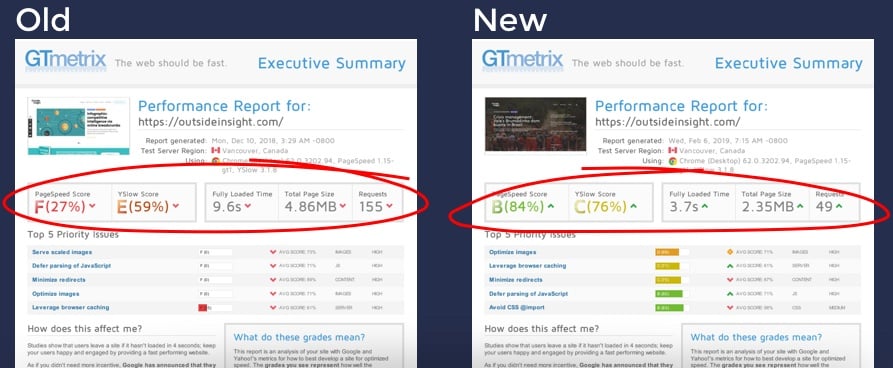
Performance scores
Web performance was one of the top goals and biggest challenges of the project.
Through a combination of techniques, we managed to achieve a Pagespeed score of 84 (up from 27) and reduced the page load time from 9.6 s to 3.7 s.
(The original Pagespeed goal of 85+ was reached, but has since been reduced by the addition of further scripts).
Speed is a means to an end, though. We all know that faster sites are “better” but what can we measure?
There are two ways that increased site speed has benefited Outside Insight; SEO and user engagement.
Improved organic traffic
One of the biggest wins for the project was the boost to organic traffic.
Average search position went from 27 to 15 and the click-through rate from 4.1% to 7.2%.
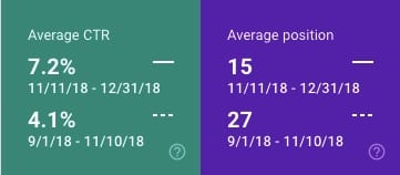
The average rank position halved!. Which is a massive gain to make overnight.
The click through to the site from Google almost doubled.
These metrics are influenced by some other things we’ve done too but it’s mainly about the site.
Summary
We loved working with Ben and the Outside Insight team on this project.
Outside Insight now have a website that is performant, robust and beautiful. It’s a marketing platform that is already proving it’s value and will continue to do so for years to come.
Do you have a similar project in mid?
If you like the work and approach that you’ve seen here, and you have a WordPress project coming up, we’d love to talk to you about your requirements.